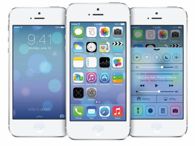
Apple’s unveiling of the much-anticipated iOS7 has brought forth a slew of commentary from all around the web. From Erik Spiekermann’s violent dislike for the use of Helvetica Thin to Khoi Vinh of Subtraction’s more moderate and reserved wait-and-see attitude no one can keep their mouth shut about this particular Apple release—including me.

So the big question—Is iOS7 better than its predecessors?
I certainly believe so. The flat design and selection of a lighter & overall cleaner interface greatly appeals to me. It feels to me as if iOS7 is finally catching up to the amazingly designed shell it is housed within.
Get Ready ladies and gentleman. Your iPhone is about to put on its fashionista pants and lose 10lbs.
Come on, have you seen the new calculator app? I want to hug it, kiss it and make beautiful music with it! And the calendar—in the words of George Takai “Ohh My!” The complete lack of green felt in the (mostly useless) Game Center—YES I think they are getting something right! I more I see the more I find my salivary glands expressing themselves.
Yes. That is drool covering my MacBook!
But I have reservations.
The (lovely) thin type.
I know that retina displays have all those lovely extra pixels in there and can make just about everything look ultra sexy and sleek but what about the rest of the iPhone world? What does Helvetica thin look like on an iPhone4? I’m not convinced it will look very good. I can already feel the eyestrain.
Mega gradients
Here I am personally biased, but the new app icons are throwing me for a total loop. I feel blinded by the heavy cyan in the Safari, weather, and mail icons. The green in some of the others is killing me too. I feel like the icons got put in a gradient acid bath before being released. The iOS7 icons seem incongruent with the other design updates.
Too Flat?
Touch-screen devices are unnatural by their very nature. They have little to no tactile buttons. We often rely on visual cues, such as (gasp) a bevel to tell us what to do. The fewer of these cues that exist the more we have to depend on learned behaviors. The dependency on tutorials that no one wants to sit through grows. Are we ready for less indication? Do people already know that if you swipe down a menu with pop up or that id you double-tab the top bar in Safari it will take you to the top of the page? How natural is holding the power and home button simultaneously to make a screenshot? I wonder, how ready are we, really?
The verdict is certainly out on this one, but I will be upgrading the first chance the almighty Apple allows me. I just hope it is everything it is cracked up to be.
I’m an admitted Apple fan-girl, so I have only one request—Apple Inc. please don’t fuck it up.
Learn more about the shiny new iOS7 from the source, Apple!


0 Comments