The bus pulls in, and you quickly snag a seat, ready to zone out.
Suddenly, laughter erupts across from you.
A guy is hunched over his phone, barely holding it together. He catches your eye, grins, and flips the screen toward you.
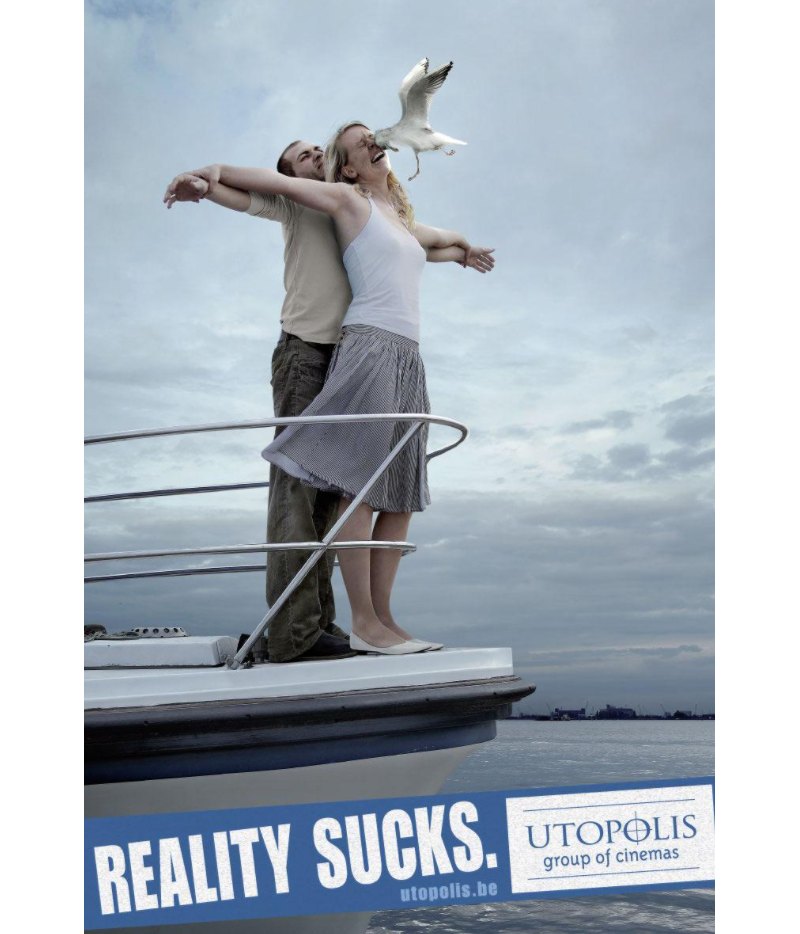
Onscreen was an old Utopia Group of Cinemas ad—two lovers posed Titanic-style on a ship’s bow, but with a twist, a giant seagull smacks right into the woman’s face.
The tagline? “Reality Sucks.”
One glance, and you’re chuckling.
Funny, clever, unforgettable. This ad nailed it!
The best design ads grab us, make us laugh, and pull us into their story.
From bus stops turned into chocolate bars to billboards transformed into life-sized experiences, here are 13 unforgettable design ads that spark emotion and make us want to buy.
13 of the Best Design Ads That Got Us Buying
Heinz Ketchup’s “No One Grows Ketchup Like Heinz”


The Design Moment
The commercial ad shows a bottle of Heinz ketchup seemingly “growing” right off a tomato plant. Meanwhile, the print counterpart is equally charming featuring a bottle of Heinz flipped upside down and a tomato stem placed up top, as if it’s an actual tomato.
The second version shows the full ketchup bottle cut into thick slices like a real tomato. A small white caption stands out against the red background.
Why It Works
The visuals are simple but playful, giving a funny twist to Heinz’s claim of using real tomatoes and “growing” quality in their ketchup. Both ads have a subtle humor that hits the mark. The print ad is especially memorable and charming, it’s one of those that makes you smile… and maybe crave ketchup at the same time.
McDonald’s “Follow the Arches”


The Design Moment
McDonald’s sliced its famous Golden Arches and placed the sliced parts on a red billboard using them as directional arrows.
Why It Works
Simple yet brilliant. The design plays with the familiar arches to point you toward the nearest McDonald’s location, using a touch of humor to reinforce that McDonald’s is everywhere and always accessible. The minimalist billboards are easily recognizable thanks to their brilliant red shade and the famous yellow color of the arches.
Volkswagen’s “Precision Parking”

Source
The Design Moment
Volkswagen’s clever ad campaign takes “idea-driven” to a whole new level. In one commercial, we see a cat squeezing into a tiny box, an octopus settling into a small shell, and a massive polar bear disappearing into a tiny ice hole. The punchline? “Easy Parking in Almost Any Space.”
The print ad follows suit, featuring a porcupine (a literal symbol of “don’t get too close”) perfectly parking itself next to delicate bags of goldfish. The understated copy reads, “Precision Parking. Park Assist by Volkswagen.” No flashy cars. No product close-ups. Just a brilliant, simple concept that’s impossible to forget.
Why It Works
This campaign’s genius lies in its restraint. By leaving the product out entirely, Volkswagen puts 100% of the focus on the idea: precision and ease. The relatable humor grabs your attention, while the elegant simplicity leaves a lasting impression.
Take the print ad, for example, the porcupine and goldfish pairing is a masterstroke of visual storytelling. It’s quirky, funny, and instantly conveys the message without a single car in sight.
It’s a refreshing reminder that great advertising isn’t about showing off, it’s about making you feel the value of the product. Volkswagen’s bold choice to trust the idea over the image is a lesson in creative confidence, and guess what? It works.
Kit Kat’s “Have a Break” Benches

The Design Moment
Bus stops and park benches that look like unwrapped Kit Kat bars. It’s a genius move. Design-wise, the chocolate bar already fits the bench design, and adding that bit of iconic tagline “Have a break,” just finishes everything.
Why It Works
This ad is placed exactly where you might need a break, waiting for the bus or after walking around the park. It’s both witty and visual, with a design that surprises and delights people in a relatable setting. It’s like Kit Kat saying, “Life’s stressful, take a break, right here!”
Apple’s “Shot on iPhone”

The Design Moment
Back in 2015, Apple changed the game with its now-iconic “Shot on iPhone” campaign. By featuring stunning photos taken by everyday users—creative influencers and photographers alike—Apple turned user-generated content (UGC) into an art form. These images, printed on massive billboards with the understated tagline “Shot on iPhone,” weren’t just ads; they were statements.
Why It Works
This campaign hit all the right notes by showcasing the magic of the ordinary. The photos captured slices of daily life, beautiful, relatable, and surprisingly professional. At the time, the idea of taking “pro-level” photos with a phone was revolutionary. Apple wasn’t just selling the iPhone 6, it was selling possibility.
Seeing those images felt personal like Apple was telling each of us, “You have this kind of creativity in your pocket.” It was a bold yet quiet celebration of connection, artistry, and the power of technology to elevate the everyday.
And let’s be honest, those billboards didn’t just make us admire the photos; they made us want to be the ones taking them.
IKEA’s “Everyday Heroes”

The Design Moment
Leave it to IKEA to take something as mundane as a toilet brush and turn it into a showstopper. Their latest ad campaign doesn’t just showcase everyday items—it celebrates them. With bold colors and clean, playful visuals, IKEA makes these household staples feel like they belong in an art gallery.
Why It Works
This campaign is pure genius because it blends the practicality of Swiss design and Bauhaus principles with a wink of humor. It’s a love letter to the unsung heroes of the home: bathroom rugs, coat hooks, hangers—things we barely notice but rely on every single day.
By highlighting their form and function in such an artistic way, IKEA reminds us that even the simplest objects can spark joy when designed thoughtfully.
The bright colors and striking visuals make these items pop, while the clever messaging says, “Hey, these little things? They make your life better.” It’s relatable, heartwarming, and subtly inspiring. And just like that, IKEA makes us look at our toilet brush with a little more affection.
Guinness’s “Made of More”

The Design Moment
This print ad shows a woodpecker perched on a tree, pecking and drilling away on the trunk. The twist? Instead of just a typical hole, the bird carves out a finished Leaning Tower of Pisa replica. At the bottom right, the copy reads, “Some Are Made of More.”
Why It Works
The design works on two levels, and both are spot-on. First, it cleverly uses the woodpecker’s persistence to symbolize the effort and quality that goes into every pint of Guinness. The second is that it plays on the thought that Guinness lovers are “made of more,” saying that, unlike ordinary folks, they stand out from the crowd. It’s a clever way of showing that it’s not about the beer, but the kind of people who choose it.
Nike’s “You Can’t Stop Us”

The Design Moment
A split-screen showing different athletes, united in movement.
Why It Works
The split-screen design is visually striking. It’s an artistic way to communicate unity and resilience without words, just raw, beautiful visuals that capture Nike’s spirit.
The copy is also fantastic. It features a bold black type that says “You Can’t Stop Sport.” Superimposed above the last word is the word “Us” in a red shade. Right below it is a short sentence that reinforces Nike’s ethos and message saying, “We may start from different places, but together we’ll rise stronger.” Then there’s the tiny iconic check mark.
Coca-Cola’s “Share a Coke”

The Design Moment
Personalized Coke bottles with names and titles like “BFF” and “Soulmate.” It’s a unique concept that transforms the entire product into a personalized item for the end user. Very few can create such a heartwarming and distinctive campaign and Coke did it perfectly.
Why It Works
What makes this work is the emotional connection it creates. Something as simple as a bottle or can of Coke feels like a gift or a surprise. This means each purchase feels personal. It even adds a sense of belongingness, making you want to find “your” bottle or grab one for a friend.
Levi’s “Go Forth”

The Design Moment
This campaign showcased raw images of people in real-life settings. They’re exploring, living, and working in rugged environments that bring an authentic feel. The use of a playful, rugged font also enhances the design, creating a sense of individuality that captures Levi’s jeans.
Why It Works
These ads are packed with personality and individuality. With bold, eye-catching images and portraits, they bring a personal vibe to each shot, making it easy for people to picture themselves in the campaign. The copy helps reinforce the layer of self-expression as if Levi’s is speaking right to you.
It all comes together, showing Levi’s is more than just a brand but a lifestyle that celebrates positive changes, courage, and being unapologetically yourself.
Spotify’s “Wrapped”

The Design Moment
Spotify went all out with this campaign, making it seem like it’s a party for your ears. They took user data, like minutes listened to and favorite genres, and transformed it into colorful, punchy visuals that scream “Spotify.” Each ad graphic packs a personality that makes listeners feel like the main character.
Why It Works
Spotify’s Wrapped is genius because it’s all about their users. They’re not just stats, they’ve given users a badge of honor for their musical taste. When users post their Wrapped, they’re promoting Spotify for free, making them unofficial brand ambassadors.
Absolut Vodka’s “Absolut Cities”


The Design Moment
One look at this campaign and you can tell it’s brilliant! Creatively showcasing Absolut bottles into art by blending them with city landmarks and cultural symbols. Popular cities like New York, Los Angeles, and Paris are just some cities featured. The creativity used in these ads makes it a standout.
Why It Works
Talk about creativity and subtlety, these simple bottle shapes are perfect canvases for making an ordinary vodka campaign into something personal and culturally rich. By focusing on cultural identity and creativity, they transform the Absolut bottle into more than just a product. They infuse it with the spirit of the city that it represents, not to mention making it memorable.
Why These Ads Succeeded
Each of these ads used design as a language of its own, saying a lot without needing too many words. Here’s what made them so effective:
Simplicity with a Twist
Minimalism doesn’t mean boring, it means getting creative with what’s familiar, as McDonald’s did with their arches or Heinz with their ketchup bottles.
Emotional Storytelling
Ads like Apple’s, for example, put focus on universal human moments. It lets the design tell a deeper story that echoes across cultures and backgrounds.
Humor with a Touch of Relatability
A little laughter goes a long way! Volkswagen’s parking ad had people chuckling, proving that humor helps a brand stick in people’s minds.
Helpful Tips for Creating Your Own Memorable Design Ads
Want to make your ads memorable? Here are a few things to keep in mind:
1. Understand Your Audience’s Humor
Know what your audience finds funny. Integrate a clever twist or some quirky humor that feels authentic.
2. Go Simple Yet Be Striking
There’s no need to include millions of elements into your designs, sometimes simplicity is the most effective. Think of how Nike added that split screen to their campaign. It’s simple yet striking.
3. Be Creative With Familiarity
Use existing elements like your logo in unexpected ways like what McDonald’s did with their campaign. People love seeing brands think outside the box so this is a great move.
Wrapping Up
Great design can turn a simple ad into an experience. It can make you laugh, feel something, and, most importantly, remember the brand.
So, next time you’re scrolling, keep an eye out for the ads that make you stop and feel something. Odds are, there’s some design magic at work that’s making you pause, smile, or even buy!
—-
Ready to make your next ad unforgettable? Let Nicole Steffen Design help you in crafting ads that captivate, connect, and leave a lasting impression. Book a short call and let’s dive into the art of memorable marketing!