You could hear a pin drop in the room.
Designers, creatives, and home decorators–all hunched over the screen.
Waiting.
“What’s taking so long?” said one.
“It’s mid-December, they should have dropped it by now!” said another.
Finally, the screen refreshes.
And the room fills with “oohs” and “aahs.”
It’s Mocha Mousse as Pantone’s Color of the Year for 2025!!
—-
Okay, so maybe it wasn’t as dramatic as that.
But for color trend enthusiasts, Pantone’s Color of the Year is a big deal.
Designers, marketers, and brands look to it for inspiration, even direction, for shaping their campaigns for the coming year.
And for good reason, too,
Color is like marketing’s secret handshake.
The unspoken language that says, Trust me, Buy me, or sometimes, Keep scrolling.
Pick the right color, and your brand will turn heads and be unforgettable.
Choose the wrong one?
Well, you risk looking like a knockoff of everyone else.
But while color trends are all the rage, they can be tricky.
They can elevate your brand or make you disappear in a sea of sameness.
For this color trend guide, we’ll not just tackle the trending colors for 2025 but also make sure you understand how to make those trends work for you and your brand while steering clear of trend mistakes.
The Star of the Show — Pantone’s Color of the Year
Drumroll, please…
Pantone’s 2025 Color of the Year is PANTONE 17-1230 Mocha Mousse.
Sounds delicious, right? This rich, warm brown is a total vibe. Think cozy, luxurious, and a comforting hug in color form.
Why Mocha Mousse? According to Pantone, it’s all about “thoughtful indulgence, harmonious comfort, and feelings of contentment.” It’s elegant but earthy, perfect for a world craving balance amidst constant change.

Where You Might See Mocha Mousse
- Fashion: Leather jackets, suede boots, and cozy knits are primed to embrace this earthy tone.
- Interior Design: Expect Mocha Mousse to dominate kitchens, with accents on cabinetry and matte finishes on hardware.
- Packaging: Eco-conscious brands will use it to signify sustainability and authenticity, imagine seeing these shades in coffee cups, chocolate boxes, or skincare lines.
Pantone has also collaborated with other brands including Post-It and Libratone to celebrate the debut of Mocha Mousse. They’ve created limited edition products sporting this unique and rich, warm tone.

Color Trends for 2025 — The Other Heavyweights
Pantone may dominate the color conversation, but other key players in the color world have also shared their choice of colors for the year.
And it’s a good thing too! These different opinions create a rich and diverse palette for designers and marketers to explore.
Now let’s take a look at all the other colors setting the tone for 2025.
Benjamin Moore — Gorgeous Cinnamon Slate and Beyond
Paint and coatings company, Benjamin Moore has crowned Cinnamon Slate (2113-40) as their Color of the Year for 2025.

A rich and warm earthy terracotta shade, it reflects a grounded timeless elegance that according to the company is set to be a part of creating cozy, restorative spaces throughout the year but especially during the fall season.
The company describes the color of Cinnamon Slate as a mix between “velvety brown and heathered plum” giving you a subtle plum shade with a hint of neutral brown.
You can use this with an expanded palette using supporting tones like Sea Salt, Chowning’s Tan, Leather Saddle Brown, or Tissue Pink.

These color combinations evoke warmth and stability, making them perfect for interiors, lifestyle, wellness, or artisan-focused brands.
Sherwin-Williams — Color Capsule for 2025
Instead of a single shade, Sherwin-Williams doesn’t name a single “Color of the Year” for 2025. They take an inclusive approach by presenting a 2025 Color Capsule of the Year that features not one, but nine colors! Whew!

This curated palette offers more versatility highlighting several hues ideal for different styles and designs. Their chosen colors are as follows:
- Sunbleached (SW 0073)
- Clove (SW 9639)
- Bosc Pear (SW 9110)
- Grounded (SW 6089)
- Chartreuse (SW 0073)
- Malabar (SW 9110)
- Mauve Finery (SW 6282)
- White Snow (SW 9541)
- Rain Cloud (SW 9639)
Combining deep tones, bright whites, and soft hues, these shades reflect vintage nostalgia as well as modern design aesthetics.
Dulux — True Joy
Internationally renowned architecture paint brand, Dulux, proclaims True Joy as their 2025 Color of the Year. It’s a vibrant and uplifting shade and is chosen to celebrate optimism and creativity.

It’s also a color that the brand hopes will inspire people to move out of their comfort zone, embracing something bold and cheerful instead of something subtle. This shade works great with greens and ground neutrals.
As for branding and marketing, this exciting yellow tone is the perfect color for brands that want to show energy and a modern touch.
Digital-First Color Trends for 2025
In the digital space, the digital design world is pushing for bright, eye-catching shades that stop people from scrolling off incessantly. Here are a few of the color trends you can expect:
1. Hyper-Saturated Gradients
Gradients are already everywhere and it seems it’s not leaving just yet. In 2025, bright, hyper-saturated gradients are still going to be popular. They’re perfect colors and visuals for social media campaigns and online platforms where attention is at a premium. Bright, polarizing shades like neon pink transitioning to citrus yellows and other electric shades will still be a constant.
2. AI-Powered Dynamic Color Palettes
More and more brands are using AI to generate their creatives, whether for social media posts or campaign visuals. Huge companies, like Coke, have even created whole campaigns capitalizing on AI’s unique capacity. The results are often rich, saturated hues with bold design elements.

What’s more, expect AI to take on personalization to a new level. Brands will use AI to create more fine-tuned visuals including palettes that appeal especially to audience preference and environmental factors.
3. Retro Cyber Palette
Going strong since last year, expect to see brands still embrace a retro cyber palette. Teals, electric pinks, neon greens that often go together with metallic touches and black are still going to be hot. It’s the ideal palette to embrace for brands targeting a younger market or those who want a playful, even tech-centric identity.
4. Muted Digital Minimalism
It’s not all loud and saturated for color trends in 2025. In the next year, muted palettes like earthy browns and soft grays, creams, and greens will gain traction for minimalist brands. These are clean, modern, rich, and luxurious shades, ideal for wellness, luxury, and sustainability-focused branding or professional services.
Why Color Trends Matter for Marketers
Color trends are useful for designers, but marketers can take advantage of them too. The colors you use for your brand or product can impact how your customers perceive your brand and whether they’ll take any action.
Understanding Color Psychology
- Warm Tones: Shades like Mocha Mousse create a feeling of comfort and trust. Great for personal connection and creating comfort.
- Cool Tones: Blues and greens convey calm, reliability, and innovation, which is ideal for tech and finance.
- Bold Colors: Neons and jewel tones demand attention. Use them to add energy to social media campaigns or packaging.
You can read more about color psychology and how it affects consumers in this post.
The Double-Edged Sword of Adopting Color Trends
While color trends are exciting, it can be both a blessing and a curse.
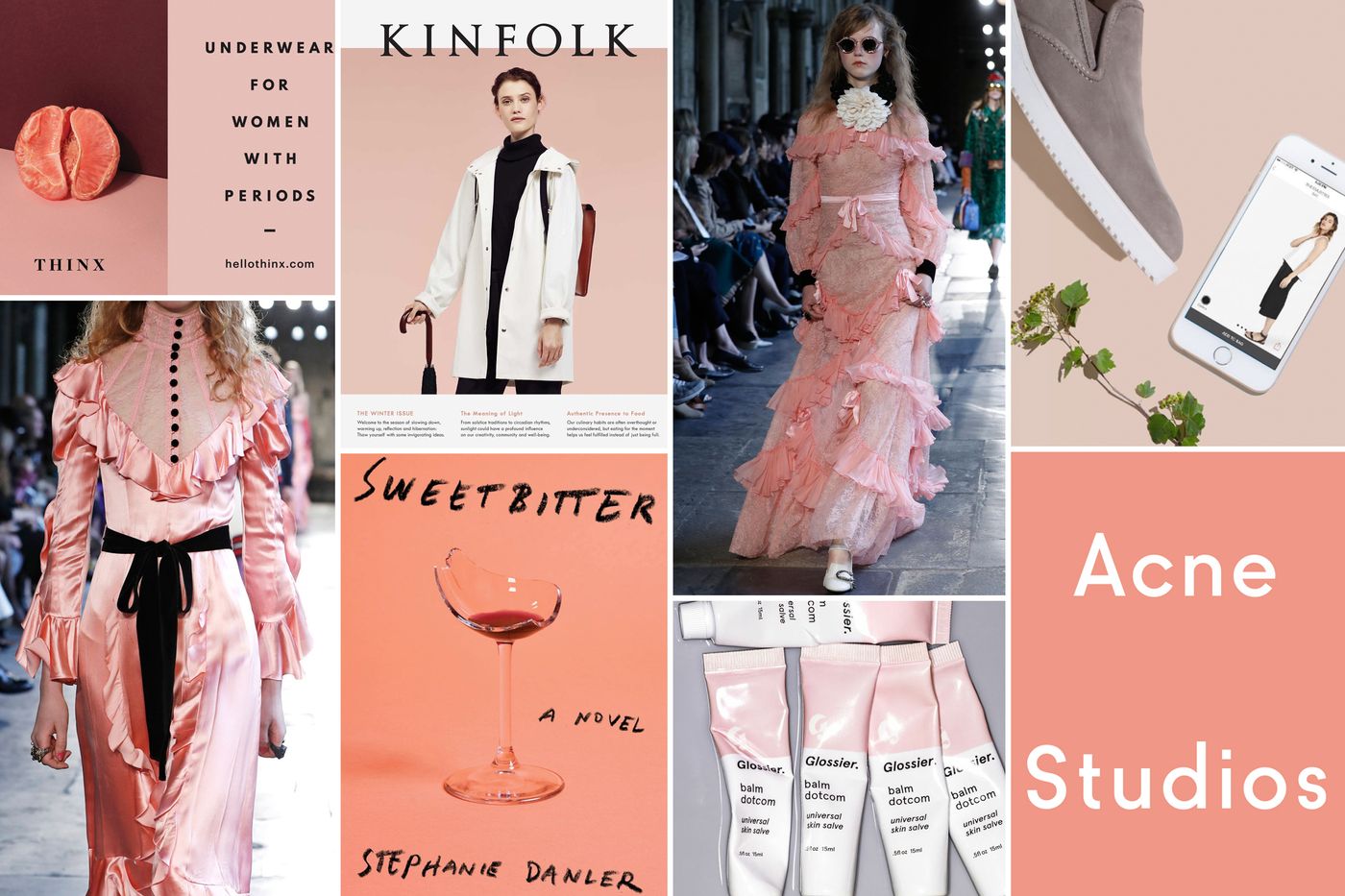
Remember millennial pink? It first became popular with Wes Anderson’s movie, The Grand Budapest Hotel.
Before long, it was everywhere!
Brands like Gucci, Celine, and Marc Jacobs made it a part of their campaign. Even Apple introduced their version of it, in the form of the Rose Gold back in 2015.

The color was cute…until it wasn’t. Soon, everyone, who is anyone was using the shade and variations of it.
Overcommitting to a certain hue because it’s trendy might make your campaign feel fresh for a hot minute, but it can scream outdated when the next big color trend comes along.
For marketers, it’s helpful to think of trends as inspiration, not instruction. The goal is to evolve your brand while keeping your authenticity.
Common Mistakes to Avoid When Using Color Trends
Dodge the trend-follower trap by keeping these tips in mind:
Don’t Overload Your Palette

Using too many trendy colors can overwhelm your design and your audience. For example, if your brand is known for its muted neutral shades and whites, suddenly throwing in a mix of neon green can dilute your identity and throw off your audience.
Ignoring Accessibility
Just because it’s trendy doesn’t mean it’s accessible. Make sure your colors meet accessibility standards, contrast ratios matter after all, especially if you’re launching digital campaigns.
Never Overcommit
The nature of color trends is that they are only true for a limited time. Don’t hinge on a rebrand or identity based on what’s hot in 2025 or whatever year it is. Instead, incorporate trends in a way where you can easily adjust them or phase them out if needed.
Don’t Overlook Your Audience
Always know who you are serving. Trends aren’t always relevant to your brand or business. If your audience is expecting calm, reflective shades because you are a wellness brand, using bright metallics or striking oranges or neons could feel off-brand.
Joining Way Too Late
With any trend, timing is everything. There’s a saying that once you see it everywhere, that trend has reached full saturation and it’s already over. To avoid this, plan and scout out for trends ahead of time.
How to Use Color Trends Like a Pro
You already know what to avoid, here’s how you can take full advantage of color trends for 2025 in your marketing campaigns, advertising, or brand creatives without losing your identity.
Use Trending Colors in Seasonal Campaigns or Specific Projects Only
Embracing color trends is great for one-off or seasonal campaigns. For instance, a beverage brand can use Mocha Mousse as their color of choice for their fall or winter campaigns. It’s low risk but there’s a high reward because the shade taps into the moment without the brand needing to overhaul their entire identity.
Use These Colors in Social Media Posts
Digital platforms are great for color trends because you can easily experiment and use shades without a long-term commitment. A simple Instagram carousel featuring color trends can grab attention and boost engagement especially if the content is relevant as well.
Use Color Trends as an Accent, Don’t Overwhelm
As a brand, your core palette is sacred, so never let trends overwhelm or take over. Trendy colors are great as accents. Use them on your website buttons, social media posts, limited edition products, specific campaigns, or call-to-action banners. Tiny bits here and there, or to complement your brand colors are enough.
Wrapping Up
A word to the wise, 2025’s color trends are your playground, but never let them run the show.
They’re perfect for sparking ideas, creating excitement, and connecting with your audience.
But, always keep in mind that your brand’s identity is the show’s true star.
So, are you ready to make Mocha Mousse (or any 2025 color trend) your own?
Whether it’s for designing packaging, running a digital ad, or launching a new product, the right colors can make all the difference.
Now, go paint the town Mocha, Cinnamon Slate, or True Joy.
—-
Need a creative partner to bring your 2025 color story to life? Let’s craft a palette that’s unmistakably you. Reach out to Nicole Steffen Design today, and let’s make your brand the star of the show!