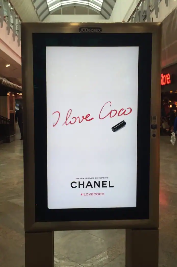
You’re scouring the mall for some last-minute presents.
For your mom, a cute tea set.
For pops, a golf shirt and hat.
And for your fashionista sister, whose birthday is coming up, you want to get something special.
While walking around, a sign catches your eye, stopping you dead in your tracks.
“I Love Cow.”
Try as you might, there’s no cow in sight.
Confused, you stand there for a second before your eye trails to the minimalist text underneath, “CHANEL.”
Then it hits you, “Oh, it says, I Love Coco! Not cow!”
You chuckle and think, that’s perfect, you were getting red lipstick for your sister anyway.

—
Typography can make or break your campaign. It might not always steal the spotlight, but it’s the unsung hero of great design.
A good, readable type serves as a mood-setter, attention-grabber, and the emotional glue that connects people to your brand. They speak before your words do.
Whether crafting an ad, printing brand materials, or bringing a project to life with words, picking the right type and font is a game-changer.
And the typography trends for 2025? Let’s just say they’re ready to flip the script.
Stick around for a few minutes, and I’ll walk you through the must-know trends to keep your type designs fresh, bold, and ahead of the pack.
Why Typography Still Matters (And Always Will)
Let’s face it, standing out in today’s scroll-happy world is tough. With endless content fighting for attention, getting someone to pause is like winning the lottery.
While trendy colors and visuals can catch attention, do you know what usually makes them stop? Typography and text.
The right font can spark emotion immediately, whether excitement or sentimentality. It’s a way for your brand to create a connection before a single word is even read.
2025 Typography Trends to Keep an Eye Out For
In the upcoming year, 2025 typography trends are leaning towards showing personality, building emotional bridges, and staying versatile.
Here’s a breakdown of the typography trends that will dominate in 2025.
1. Bold Fonts That Demand Attention

2025 is all about bold choice, and I mean this in more ways than one. Bold fonts are making a massive comeback, think oversized, loud, and unapologetically in-your-face.
- Why it works: With content everywhere, bold fonts force your audience to stop and pay attention. They make a statement with only a word.
- How to use it: Big, bold fonts are perfect for headlines, hero sections, or any place where you need to grab attention fast (like a CTA!). You want to make sure your font stands out, so keep the body text clean and readable.
- Example: Brands like Spotify and Nike have nailed the bold font look. Spotify has recently released a custom typeface called Spotify Mix while Nike uses type based on Futura. Their oversized and versatile type is hard to ignore, and it works.
2. Retro Fonts (But Make Them Modern)

Nostalgia gets a fresh makeover in 2025. Retro-inspired fonts are back but with cleaner lines and a modern twist that makes them feel familiar yet still exciting.
- Why it works: People love a throwback because it makes them nostalgic for the “good times.”
- How to use it: Great for branding, packaging, or anything that mixes vintage charm with contemporary cool.
- Example: Check out some of the typefaces on Monotype, they’ve got this perfect balance of vintage and contemporary.
3. Handwritten and Organic Fonts
Let’s step away from the digital coldness for a second. In 2025, people are craving warmth, personality, and a bit of imperfection. (Just check out Pantone’s choice for Color of the Year!) Enter handwritten fonts. These are fonts made to look like they were crafted with care, adding a human touch to your designs.
- Why it works: These fonts bring a sense of authenticity. They feel approachable, personal, warm, and just a little imperfect.
- How to use it: Great for product packaging, branding, or anything that wants to feel more human.
- Example: Think about Ben & Jerry’s, their handwritten fonts immediately make you feel like you’re connecting with a brand that cares.

4. Minimalist Fonts with Breathing Room

Sometimes less really is more. Simple, clean, and spacious typography is still a big deal. In 2025, minimalist fonts will be paired with generous whitespace, ensuring everything looks polished and chic.
- Why it works: Clean typography makes things easy to read, and clean design is timeless. Minimalist fonts scream sophistication without being pretentious.
- How to use it: These fonts work wonders for high-end brands, luxury products, or websites that want to keep it sleek and modern.
- Example: Look at Apple’s San Francisco type, the company has mastered minimalist design, and it’s why their branding always feels so elevated.
5. Variable Fonts — The Swiss Army Knife of Type

- Why it works: Flexibility is essential with changes happening at breakneck speed. Variable fonts adapt perfectly across all devices and resolutions, making your design easier to manage regardless of which platform you choose.
- How to use it: Ideal for responsive design, especially on websites where you need your fonts to scale beautifully.
- Example: Google’s Roboto Flex is a perfect example of how variable fonts can amp up your design, keeping it functional, yet sleek, and clean.
6. Custom Fonts for an Extra Flair

Want your brand to be unforgettable? Invest in a custom font. Creating a font unique to your brand can make your identity stand out in a world full of typefaces that all look the same.
- Why it works: Custom fonts give your brand an identity. It’s like a signature, only you have it!
- How to use it: Custom fonts are great for your logo, website headers, and anywhere else you want to leave a lasting impression.
- Example: It’s worth mentioning again, Apple’s San Francisco font is the ultimate flex. It is clean, distinctive, and instantly recognizable. You can tell it’s crafted to reflect the aesthetic and personality of the giant tech company. Duolingo’s “feathers” font is also unique to the brand. The font is inspired by the company’s popular owl mascot, Duo.
7. 3D and Interactive Typography

Welcome to the future. Both 3D and interactive fonts take typography beyond the flat screen, creating immersive, dynamic experiences.
- Why it works: With AR and VR in use today, typography is no longer confined to the flat screen. 3D fonts are immersive and can bring your brand to life in ways that feel like magic.
- How to use it: Try it on your website, in ads, or even on social media campaigns. Interactive fonts make your audience feel like they’re part of the experience.
- Example: Check out the awesome projects on Awwwards, they’re pushing the boundaries of interactive typography like no one else.
How to Use These Trends Without Overdoing It
Okay, before you go on a font-buying spree and embrace these 2025 typography trends, there’s a fine line between being stylish and overwhelming your audience. Here are a few things to note when incorporating these trends into your designs.
1. Stay True to Your Brand
Bold fonts? Love them. Retro vibes? Totally in. But pause for a second, do these styles fit your brand’s voice? A quirky, handwritten font might feel off if your brand is about sleek professionalism. Similarly, minimalist fonts could feel too cold for a fun, playful brand that targets a younger audience.
Pro Tip:
Ask yourself, “Does this font support the story I’m trying to tell?” If the answer is no, move on, even if the font looks amazing.
2. Prioritize Readability
Sure, ornate or experimental fonts look cool, but if your audience can’t read your message, you’ve lost the plot. Readability is non-negotiable, especially for key elements like body text, CTAs, and product descriptions. Remember, the ‘I Love Cow’ ad?
Pro Tip:
For body text, stick to clean, sans-serif fonts or well-spaced serif options. Save the bold or decorative fonts for headlines and accents. Always test your typography at different sizes to ensure it works across platforms.
3. Balance is Everything
Design is a lot like cooking, adding too much of one thing can ruin the dish. If you’re using a bold or retro font for your headline, keep the body text simple.
It’s like Coco Chanel said: “Before you leave the house, look in the mirror and take one thing off.” In design, that could mean removing an extra graphic element or toning down a color to let the star of your layout shine.
Pro Tip:
Stick to two or three fonts max in any design. Play with variations (like weight or size) within those fonts to add depth without creating chaos.
4. Context Matters
Typography doesn’t exist in a vacuum. A 3D font might look stunning on a website header but awkward on a printed flyer. Similarly, a retro font might feel out of place in a hyper-modern tech app.
Pro Tip:
Consider where your design will live. Will it be printed? Viewed on mobile? Scaled for social media? Match the font to the platform and its specific needs.
5. Test Before You Commit
Fonts can look drastically different in real-world applications compared to a mockup. Before you roll out a new typography style across your brand, test it with your audience.
Pro Tip:
Run A/B tests for web designs or social media graphics. See which font choices resonate most with your audience before fully committing.

Wrapping Up
Typography is more than just picking a font, it’s about making a connection with your audience.
As we venture into 2025, let these typography trends inspire you to take creative risks.
Whether you’re leaning into bold statements, retro charm, or futuristic 3D designs, remember, balance, readability, and staying on brand are your best friends.
So, go ahead, experiment, have fun, and let your typography do the talking. The right font might just be the spark your designs need to stand out. Happy designing!
—–
At Nicole Steffen Design, we help create designs that stop the scroll and spark connections. Let’s team up to make your brand look as bold, approachable, or stylish as you feel.
Ready to transform your type game? Let’s chat!