“Man, Riley, I don’t think they get it,” Max groans.
“Geez, don’t worry, it’s niche,” Riley replies.
He adjusts their sign: Hydration Zone™ — $4 in Comic Sans.
A car slows down, reads it, then speeds up.
“Riley, we’ve been here three hours and no one’s stopping,” Max gripes.
“Fine, you try,” Riley sighs, handing over the cardboard.
Max grabs a Sharpie and scribbles a new sign: Fresh Lemonade – $1, large and clear.
He tapes on a smiley face for good measure.
“You ruined the brand,” Riley mutters.
“No, I didn’t… just wait,” Max says.
Ten minutes later, they’re out of cups.
—
Turns out, even the boldest branding ideas can fall flat when they’re too clever for their own good. Whether it’s a hydration empire or a global campaign, when your message or design misses the mark, the results are awkward at best and catastrophic at worst.
Luckily, a flop doesn’t always mean it’s over.
Yes, it sucks. When the marketing campaign you were so sure would be a hit ends up becoming a major headache instead.
But with the right pivot, a better design, or a clearer message, brands can bounce back smarter and stronger.
Let’s break down five real-world flops that turned into surprising wins in the long run.
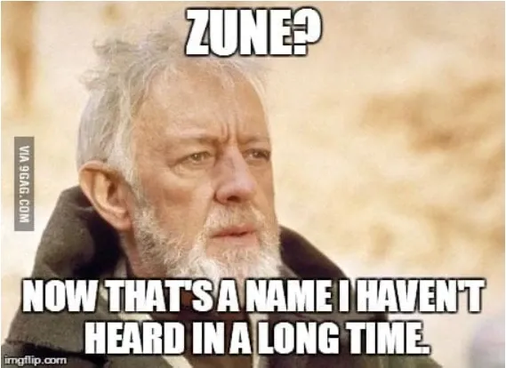
1. The Zune’s Mysterious Comeback (Microsoft’s iPod Rival)

What Happened:
In 2006, Microsoft decided it was time to launch a product to rival the iPod. Enter the Zune, a portable media player that was supposed to be Apple’s biggest competitor.
Spoiler: It wasn’t.
The Zune was bulky, the software was buggy, and, worst of all, it failed to beat the iPod in design or user experience. Years before its exit, it was already flatlining. Within five years, the Zune was officially dead. Microsoft pulled it off the market and branded it a failure.
Even though it had a premature demise, there’s a plot twist. It didn’t stay fully dead. There were elements of the Zune that didn’t get buried with it. These elements instead lived on in the Microsoft ecosystem in surprising ways.

The Turnaround:
Zune’s failure didn’t just disappear into history. The software infrastructure behind it laid the groundwork for later products. For example, Zune’s music management system evolved into Xbox Music, which then became part of Microsoft Groove, helping to shape future Microsoft music services.
Even more interesting, the Zune’s user interface influenced later products, especially in Windows Phone (remember those?). And yeah, I know, these products are no longer around, but it shows you that sometimes failures can be useful.
The Zune was, in essence, a design failure that provided invaluable lessons about user interface, software management, and, most importantly, the integration of hardware and software.
What You Can Learn:
What’s the takeaway from all this? It shows that even when a product fails, it doesn’t mean you toss everything you’ve learned.
Often, the missteps in design and development can lead to better ideas in the future. Like with Zune, you might be able to take elements and use them for other things.
The key is to build a design system that doesn’t just deliver stunning visuals, but one that integrates feedback and evolves with time. Don’t fear failure; use it to inform your next big thing.
The “Wow, This is Awful” Launch of the E.T. Video Game (Atari, 1982)

What Happened:
The year was 1982. Atari was in a mad rush to release a video game based on the blockbuster movie E.T. the Extra-Terrestrial. Everyone was excited, but there was just one problem.
The game was terrible.
It was rushed through development, had clunky controls, and awful graphics. Atari wanted to capitalize on the movie’s success, and the game quality took a big hit.
When launch time came, the game sold poorly. And the excess inventory? Unceremoniously dumped in a New Mexico landfill. Yep, that actually happened. The Verge even did a whole deep dive into it.
Atari’s reputation took a deep blow during the fiasco. You would think that was it for the company and the industry (because soon after the video game industry went bust), but there was a silver lining. True, Atari’s reputation was tarnished, but the disaster led to a massive shift in the gaming industry.
How It Helped:
The fallout from the E.T. game created a seismic shift in the way developers approached game design and marketing. Before E.T., developers hurried projects to meet deadlines and make a quick buck.
Afterward, however, the industry became much more focused on quality and consumer experience, and this led to a more thoughtful, design-driven gaming market that followed.
Fast forward a few decades, and you can trace the lessons learned from the E.T. debacle to the success of modern game franchises. Marketing and design are now carefully aligned, gameplay is tested before release, and developers are far more concerned with creating a noteworthy product than simply capitalizing on trends.
Hiccups are still here and there, but for the most part, the whole industry learned its lesson.
What You Can Learn:
Rushing to market might be tempting when there’s hype surrounding your product or brand. But if your design and messaging aren’t aligned with real user needs, you’re setting yourself up for disaster.
A strong design system encourages testing, feedback loops, and strategic, intentional timing. So, remember, take your time to get it right, even when everyone is pushing for a quick turnaround.

The Unusual Launch of “Diet Coke for Men” (Coca-Cola, 2005)

What Happened:
Back in the mid-2000s, Coca-Cola had a problem — men weren’t drinking Diet Coke. The brand was wildly successful, but it carried a reputation as a “women’s drink.” And for a certain kind of sugar-averse male consumer, that was a dealbreaker.
So, Coca-Cola did what any massive corporation might do when faced with a perception problem: they overcorrected. Enter what we’ll lovingly refer to as “Diet Coke for Men.” Officially, it was called Coke Zero, but let’s not kid ourselves, the branding spoke louder than the label.
It came wrapped in black and silver, with a logo that looked more at home on a video game console than a soda can. The commercials were full of over-the-top masculinity. Think football, action sequences, jokes about dating, and plenty of nods to how this was the drink for “real guys.”
It didn’t take a genius to get the message. You could now enjoy a zero-calorie soda without compromising your manhood.
But instead of winning over men, the whole thing felt like it was trying too hard. Women weren’t exactly thrilled by the exclusionary tone, and men weren’t convinced they needed their version of Diet Coke in the first place.
Okay, Coke Zero wasn’t a full disaster by any means, but the brand came out swinging with gender-coded energy that aged like a cargo-shorts commercial.

How It Turned Around:
To Coca-Cola’s credit, they didn’t just double down. They evolved.
Over time, the company stepped back from the gender gimmicks and began focusing on what mattered: zero sugar, bold taste, clean design.
By the time Coke Zero Sugar launched in 2017, the messaging had shifted dramatically. Gone was the wink-and-nudge masculinity. Replacing it? A product built for everyone who wanted a sugar-free soda that didn’t taste like cardboard.
The design became sharper, the voice more confident, and the tone more modern. Instead of trying to appeal to men by excluding others, the brand leaned into health, experience, and lifestyle, which is a far more inclusive and lasting approach.
Coke Zero Sugar became one of Coca-Cola’s fastest-growing products globally, with wide appeal across age, gender, and market segments. It wasn’t just a rebrand, it was a full strategic correction that paid off.

What You Can Learn:
Trying to stuff a brand into a narrow identity, especially one built on tired cultural tropes, is a fast track to irrelevance. The “Diet Coke for Men” approach failed not because men don’t like diet soda, but because nobody likes being pandered to. Especially not with branding that assumes their identity is a checklist of stereotypes.
What saved Coke Zero wasn’t a new name; it was a new perspective. Coca-Cola stopped trying to tell people who the drink was for and started showing why it was worth drinking. Inclusive design, values-first messaging, and a focus on real consumer needs turned a gimmicky launch into a long-term win.
What to take away from this is that the brands that know when to pivot (and aren’t afraid to leave bad ideas behind) are the ones that stay standing. The macho marketing may have made noise, but the quiet confidence that followed is what sold.
Mailchimp’s Mascot Gets a Makeover and Almost Misses the Mark (2018)
What Happened:
Mailchimp, the beloved email marketing platform, is known for its quirky personality and iconic mascot, Freddie.
But in 2018, the company dropped a bold new brand identity. They did the works! New typefaces, colors, illustrations, and an overall shift toward a more “grown-up” tone. Gone was the playful email chimp with his winking face front and center.
What replaced him was a set of abstract, artsy visuals, including a yellow-heavy palette and strange, surreal illustrations (like dismembered hands and melting objects).

It was an ambitious attempt to signal maturity and evolution, but the initial rollout sparked a lot of head scratching and even backlash. Loyal users weren’t sure if Mailchimp was trying to be an art project or still a usable marketing platform.
Some felt like the brand had gone from relatable to overly conceptual, potentially alienating smaller users it had once championed. You can read more about it in this article.

How It Turned Around:
Mailchimp didn’t walk back the redesign, nope, but they did listen.
Over time, the company clarified how this new visual system would live across all channels. They dialed up the usability of the new design system, introduced clearer user flows, and made sure Freddie didn’t vanish entirely; he just got a stylish glow-up.
The company also did a much better job of explaining why they did the redesign. For them, the redesign was about embracing the full journey of a business, from scrappy beginnings to scaling enterprise-level success. With that context, users came to appreciate the shift.
These days, however, they’ve brought back Freddie. The lovable chimp is once again seen as winking and smiling in his iconic cap. I mean, let’s face it, when we hear Mailchimp, his face is the one that’ll pop up (along with the Batman yellow and black colors) and not the weird, hand thing.

What You Can Learn:
If you’re going to do a bold rebrand, you’ve got to bring your audience along for the ride.
This can’t be stressed enough. Never leave your users or audience in the dark or surprise them with changes without any explanation or context. A great design system is more than just visual aesthetics; it should reinforce your brand’s personality, scale with your growth, and most importantly, be understood by your users.
Also, remember, creativity is great, but clarity is non-negotiable.
The Great (and Now Hilarious) Fiasco of the McDonald’s “McD Stories” Twitter Campaign (2012)

What Happened:
It was January 18, 2012. Twitter was still Twitter (pre-X era), timelines were mostly chronological, and brands were just starting to realize the viral power of social media. McDonald’s saw an opportunity to tap into the momentum, and what could go wrong with a little feel-good user-generated content, right?
The original idea was simple. They were going to promote McDonald’s partnerships with local, organic farmers. The hashtag was supposed to be #MeetTheFarmers, wholesome, direct, and safe.
But somewhere during the day, the marketing team decided it wasn’t quite catchy enough. They swapped it out for #McDStories, hoping people would flood the feed with warm childhood memories, late-night drive-thru adventures, and love notes to Chicken McNuggets.
And the internet delivered, well, the internet.
There were no nostalgic tales here. Instead, users doled out horror stories. From sketchy service and food poisoning incidents to broader criticism about health, labor, and ethics. It turned into a real-time roast. The campaign spiraled fast, and within two hours, McDonald’s pulled the plug.
What was meant to be a feel-good moment became a masterclass in how quickly social media can flip the script.

How It Helped:
Now, to their credit, McDonald’s didn’t ghost the platform or slap on a fake smile and pretend nothing happened. They listened and learned. Most importantly, they adapted.
In the months and years that followed, McDonald’s made a visible shift toward more honest, human communication online. They started engaging with people directly, acknowledging mistakes, answering questions, and letting their social media voice be a little less corporate and a little more real. Ditching that perfectly polished messaging for something a bit more grounded and conversational.
What You Can Learn:
Social media isn’t a safe, controlled billboard. It’s a loud, unpredictable group chat with the entire internet. And if you’re going to invite people into the conversation, you have to be ready for all of it, not just the good vibes.
But there is an upside, mistakes (even messy, public ones) aren’t the end of the road. They’re often the starting point for better communication. Owning the moment with honesty and a clear, consistent voice can turn a PR disaster into a brand reset.
Design and messaging systems need to be flexible enough to meet the moment, not just on launch day, but when smelly things hit the fan. Because when your voice stays calm, consistent, and real under pressure? That’s when a brand earns its credibility.
Wrapping Up
You might be tempted to only celebrate the wins, but as you’ve seen, some of the greatest lessons come from the fails.
Whether it’s understanding that simplicity doesn’t always equal clarity or realizing that you don’t need to follow trends to appeal to your audience, these marketing missteps offer rich takeaways for anyone in the business of connecting with people.
So, if you’re a marketing team trying to figure things out, don’t fear failure. Learn from it.
Adjust your design system. Tweak your messaging. And next time things go wrong, you’ll be ready to pivot. Who knows, that failure might just turn into your next big win.
—
Need help building a design system that ensures your brand stays flexible, resilient, and aligned, no matter what comes your way? Get in touch with Nicole Steffen Design.