“Did you see how our competitor rebranded? They look so modern now.”
You’re on a call, and someone shares their screen. Everyone leans in.
Clean type. New color system. A logo that makes yours feel like it came from a different decade.
And there it is, that sneaky little justification forming in real time. Ours has been around since the 2010s anyway. This could be our problem. Maybe a better logo is what finally makes people get it.
So you greenlight the rebrand. The design gets approved, and the rollout goes live.
And yes, it looks better. A lot more current. Looks more “sorted.”
Then months pass.
Customers still ask what you do. Sales is still explaining the same thing twice on every other call. Marketing and product are still describing the company in different ways, depending on who’s talking.
Nothing broke. But nothing got clarified either.
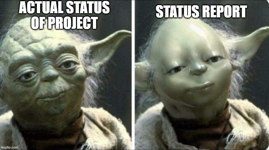
So, what’s happening? The logo changed, you have a fresh new look, yet everything underneath it stayed the same.

What Your Logo Does And What It Can’t
Here’s what a logo does well: it marks what’s already there.
Nike’s swoosh works because Nike spent decades building a brand around performance, athletes, and that whole “Just Do It” thing. The swoosh didn’t create any of that. It just points to it.
Your logo works the same way. Once your brand strategy is clear, the logo can represent it. But it can’t create clarity where it doesn’t exist.
So, Why Does Everyone Start with the Logo?
Because it’s concrete. You can see it. Put it on a deck and say, “Here’s what we did.” You can point to it in a meeting and show progress.
Branding strategy is messier. It’s the conversation where you realize three executives describe the company three different ways. You have no choice but to admit your messaging has been mushy for two years.
What’s more, doing it is making hard choices about who you’re for and who you’re not, something businesses would rather avoid.
Designing a logo first feels like you’re getting somewhere. The other feels like you’re stuck in a conference room arguing about semantics.
So most businesses pick what feels like progress, even when it doesn’t solve anything.

What a Brand Is (Beyond What People Can See)
A brand isn’t your logo or your color palette. It’s the framework that tells your whole company how to show up consistently, even when nobody’s watching.
The Framework Nobody Builds First
Look at how decisions get made inside your team.
Product ships a new feature, ask yourself, how do you talk about it? Sales gets a competitor question, so what’s the positioning? Customer success handles an escalation, what’s your response?
If those answers change depending on who’s speaking, that’s not a brand identity. That’s a group of people making reasonable decisions in isolation, each one different from the last.
A functioning brand is the logic underneath those moments. It tells you what fits and what doesn’t. It gives your team a shared way to translate what you build into something customers understand and care about.
When that framework exists, you’re not starting from scratch with every campaign. You’re building on something that’s already working.
The Three Layers You’re Probably Skipping
What complicates the issue is that most businesses work backwards. They do logo first, then some messaging, and hope the strategy sorts itself out later.
It never does.

What you end up with is a polished surface sitting on top of unclear decisions. And no amount of lipstick design fixes that. Here are the three layers you’re probably overlooking.
Mission and Positioning
We’re not talking about the mission statement that lives in a slide deck somewhere and gets dusted off once a year. This is the set of real choices that define who you serve, what you stand for, and how you’re different in a way the market recognizes.
When it’s missing, everything becomes reactive. Sales leans on whatever angle works in the moment. The website tries to speak to too many audiences at once and lands with none. Product keeps shipping, but there’s no clear thread connecting anything back to a single point of view.
When it’s working, the change is obvious. Your team can explain what you do in one breath. They know who you’re not for, just as clearly as who you are for. (I’ve repeated this point several times already because it’s crucial.) New hires don’t spend weeks trying to decode the company because the direction is already baked into how people talk and decide.
If you can’t clearly answer who you’re for and what you do better than anyone else, the logo vs brand conversation is premature. You’re not there yet.
Messaging Systems
Positioning only works if it leaves your head and becomes language that people can use.
When it’s missing, everyone improvises. Marketing writes its version. Sales tweaks it on the fly. Customer success wings it. You get a lot of activity and zero consistency.
When it’s working, the core story holds even when different people tell it. Marketing frames it one way, sales another, product another, but it still sounds like the same company. Nobody needs to check in before they know what to say.

Visual and Experiential Consistency
This is where design finally gets to do its job instead of trying to fix strategic problems it was never meant to solve.
When it’s missing, your homepage looks like 2024, your product looks like 2019, and your sales deck looks like someone made it at 11 PM before a pitch. Every campaign starts from zero because there’s no system.
When it’s working, there’s infrastructure. You have solid templates that hold and a design system that lets people move fast without reinventing the brand every time they open PowerPoint.
Over time, that consistency builds trust in a way no single campaign ever will. It’s quiet, compounds, and most of all, works.
How to Build It Right (Even When It Feels Slower)
The fix isn’t complicated, but it is sequential. The order matters more than most would want to admit. And yes, it will feel slower at first. That’s how you know you’re doing it the right way.
Start with Strategy, Not Design
Answer the strategic questions first:
- Who are you for, specifically?
- What do you do better than anyone else?
- What position do you want to own in the market?
If leadership can’t align on those answers in the same room, you’re not ready for a logo update, let alone a rebrand.
You’re not even at the branding stage yet. But inching your way at the strategy stage, the part that forces real decisions about what you’re willing to commit to and what you’re willing to let go of.
This takes time. Yes, it will feel like molasses, and people will argue. Someone will say, “Can’t we be for everyone?” (No.) Don’t worry, that’s not a problem. That’s the work.

Build the Messaging Before the Design
Once positioning is clear, translate it into a language people can use.
Don’t just throw marketing lingo for its own sake. But use language that works in a sales call without needing translation. Use narratives that connect what you do to what customers care about. Hand out proof points that make your differentiation real instead of theoretical.
This is where you find out if your positioning holds up. If it can’t survive contact with a sales conversation, it isn’t ready. Go back and tighten it until it is.
Let the Visual Identity Reflect What’s True
Only after strategy and messaging are solid should you flex your fingers and touch visual identity.
At that point, design stops being speculative. It’s not inventing meaning anymore by swapping your logo to a brighter more modern one. Instead, it’s expressing it. Making it visible, consistent, and easy to recognize across every touchpoint.
The logo, the color system, the typography, all of it starts working in the service of something already defined. That fresh look then becomes a signal of alignment that already exists, not an attempt to create alignment that never did.

Wrapping Up
Your logo won’t save your marketing. It can’t clarify positioning that doesn’t exist or align teams that aren’t working from the same strategy in the first place.
But when you do the foundational work, build positioning that’s clear, messaging that connects with your audience, and systems that make consistency easy, then the logo becomes what it should be: a marker on something that already works.
That’s when marketing stops feeling like disconnected tactics you’re holding together with optimism and overtime. In place of it, the brand starts doing the work it’s supposed to do.
The logo’s the easy part. It’s everything underneath it that most companies never build.
—
If your marketing feels scattered and your positioning isn’t landing the way you hoped, work with Nicole Steffen Design to build the brand strategy and design that pulls in the same direction. Talk to Nicole.