
A Lazy Afternoon at the Batcave
(Batman paces back and forth, deep in thought. Alfred watches, unimpressed.)
Batman: Alfred, I’ve been thinking… Do you think I need to rebrand myself?
Alfred: Master Bruce, you are a billionaire crime-fighter dressed as a bat. I’d say the brand is quite, distinct.
Batman: Yeah, but people think I’m just some brooding weirdo in a cape. I want to be more approachable. Maybe a name change? Something friendlier. How does, The Night Prowler sound?
Alfred: Sounds like a lawsuit waiting to happen.
Batman: Okay, okay. What if I add color to my suit? Maybe blue? Yellow? Ooh, glow-in-the-dark accents! And my voice! Maybe I should drop the whole growl thing. Try something, more inviting. [Clears throat] “Hi, I’m Batman! How can I assist you today?”
Alfred: Master Bruce, you sound like a customer service representative.
Batman: Ugh, branding is hard.

Rebranding is one of the boldest moves a business can make. It’s like renovating your home. You’re going for a fresh, modern look, but you don’t want to tear down the walls that make it feel like home.
Going for a rebrand means more than swapping logos or picking trendier colors. A true rebrand reshapes how customers perceive your brand and where you stand in the market.
Do it right and your brand becomes more relevant and future-proof. Do it wrong and well, Gap or Tropicana, will tell you, it’s a headache.
So, how do you evolve without losing what makes you you?
In this guide, I’ll walk you through the key steps to successfully rebrand while honoring your roots and setting your brand for future growth.
Why Rebrand?
Not every brand needs a rebrand. Some have that classic vibe that never goes out of style. These brands might just need a refresh here and there. But for others, the signs are pretty obvious when it’s time to shake things up.
If your brand feels a little dusty, outdated, or disconnected from the audience you’re trying to reach, a rebrand could be the fresh start you need.
Here’s when to start thinking about making that move:
Outdated Visuals & Messaging
Take a long, hard look at your logo. Your website. Your marketing materials. Do they feel like they were last updated during the dial-up era? If your branding is giving off early 2000s energy, it might be time to hit refresh.

Staying stuck in the past doesn’t help anyone. A modern, fresh design speaks to a new generation, one that’s more visually savvy and demanding than ever. A rebrand can make your brand feel like it’s of the moment while still honoring its roots.
Shifting Markets
Markets are never stagnant. What’s “hot” can easily become “not” if you’re not paying attention. Technology, consumer behavior, and industry norms change at lightning speed. If your brand hasn’t adapted to these shifts, you risk becoming irrelevant.
A rebrand can act like a booster shot to your business, aligning your company with the trends that matter. It’s more than being current but staying competitive. You want to position your brand as a trendsetter, not a trend-catcher.
New Leadership or Mergers
A new CEO or a big merger can feel like hitting the reset button. Whether it’s a new vision, new goals, or a new audience, when leadership changes, it’s an ideal time to rethink your brand.
A fresh set of eyes brings new ideas, and a rebrand helps communicate that shift in direction. It’s like reintroducing your company to the world but with a new perspective and sharper focus.
If your brand doesn’t align with the new leadership’s vision, it might confuse customers, employees, and investors. A rebrand can help create a clear, confident statement about where you’re heading.
Reputation Recovery
Sometimes, the best way to bounce back from a rough patch is with a brand-new face. Whether your company has faced a scandal, a public mishap, or a tough reputation to shake, a rebrand can assist in rebuilding trust and distancing yourself from the past.
Think of it as your second chance to tell your story, show your growth, and let customers know you’re evolving. This is about rebuilding your emotional connection with your audience and proving that your brand is stronger than ever.
The Brands That Made Rebranding Work
1. Mastercard – A Modernized Classic
In 2016, Mastercard subtly modernized its logo by refining the typography and simplifying its design. The company kept its iconic red and yellow overlapping circles but removed the word “Mastercard” entirely in most digital contexts.

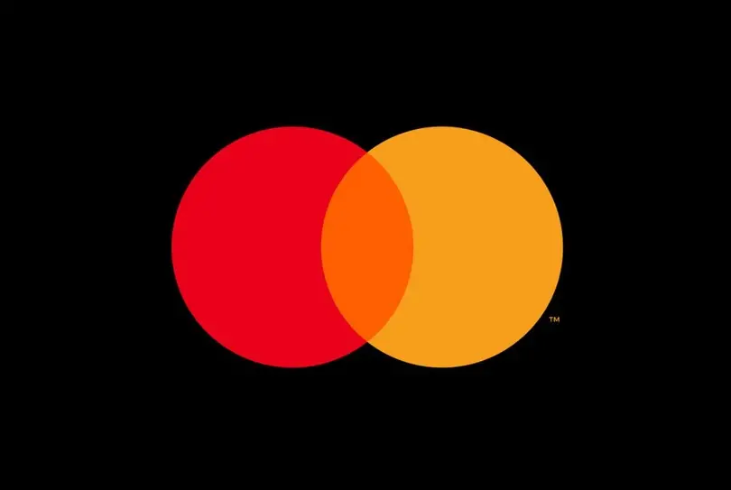
This move made the logo more versatile, sleek, and digital-friendly, ensuring brand recognition even without text. The update was seamless, reinforcing trust and credibility while adapting to a mobile-first world.
2. Dunkin’ – A Name That Matches Its Growth
Dunkin’ Donuts took a bold step in 2018 by dropping “Donuts” from its name, officially becoming Dunkin’. The change reflected the brand’s expanded menu, which included coffee, sandwiches, and other beverages, not just donuts.
Although the name change was first ridiculed, the company stuck to its guns. Despite the name change, the brand retained its playful orange-and-pink colors and familiar font, ensuring a smooth transition for loyal customers.

This rebrand helped position Dunkin’ as a modern, on-the-go brand while maintaining its heritage. It showed in their stock prices too, from $71 during the rebrand to $108 today.
3. The Mountain Dew Rebrand
Mountain Dew has undergone several refreshes, but its most recent transformation is a perfect case study of modernizing while staying true to its roots.
Known for its high-energy branding, Mountain Dew has kept its signature neon colors and edgy personality but has refined its visuals and marketing to better connect with Gen Z and millennial audiences.

The brand’s latest take focuses on bolder typography, streamlined graphics, and a more digital-friendly identity to align with consumer trends. By retaining its rebellious spirit while embracing contemporary aesthetics, Mountain Dew continues to stay relevant without losing its core fan base.
Breaking Down the Rebranding Thought Process
Step 1 — Defining What to Keep and What to Change
Before you start sketching new logos or brainstorming slogans, take a step back and ask one important question: What defines your brand?
Identify Your Brand DNA
Every strong brand has a core DNA, those unshakable elements that customers recognize and trust. This could be a signature color, a memorable tagline, or even a company ethos.
Decide What to Modernize vs. What to Retain
Not everything needs to go! Some elements may only need refinement rather than a complete overhaul.
- Keep: Iconic elements that make your brand instantly recognizable.
- Modernize: Outdated fonts, overly complicated logos, and messaging that no longer resonates.
Step 2 — Storytelling – Connecting the Past with the Future
A great rebrand tells a story. It reassures existing customers while attracting new ones by explaining why the change is happening and what it means for them.

Communicating the Transition
Transparency is key. Customers get uneasy when things change without explanation. Use blog posts, social media, and email campaigns to share the “why” behind your rebrand.
Involve your audience. Give long-time customers a peek behind the curtain with sneak previews and behind-the-scenes looks at the process.
Step 3 — The Visual & Verbal Identity Refresh
Rebranding isn’t just about slapping a new logo on your website, it involves a full refresh of your visual and verbal identity.
Modernizing Visuals Without Losing Recognition
- Logos: Simplify without losing brand essence (think Nike’s swoosh or Apple’s minimalist design).
- Typography: Choose modern fonts yet still feel true to your brand’s personality.
- Color Palette: Refresh colors for a more contemporary look while keeping recognizable hues.
Updating Tone and Messaging
Your brand voice should evolve with your audience. Is your messaging still resonating? Does it reflect your company’s values and personality currently?
Digital-First Branding
A rebrand today must be optimized for websites, apps, and social media. Make sure all assets look sharp across screens and platforms.
Step 4 – Implementing the New Brand Across All Touchpoints
Get Employees Onboard
Your employees are your brand’s ambassadors. Educate them on the new identity through internal workshops and training.

Updating External Touchpoints
- Website and social media updates
- New marketing materials and packaging
- Adapting customer service scripts and messaging
The Role of AI & Automation
AI tools can streamline the rebranding process by:
- Automatically updating brand assets across digital platforms
- Personalizing messaging for different customer segments
- Analyzing data to ensure a smooth transition
Step 5 — Measuring Success & Adapting Over Time
Key Metrics to Track
Brand sentiment: Monitor how customers react to the rebrand through surveys and social media analytics.
Engagement rates: Measure increases or decreases in website traffic, social media engagement, and email interactions.
Customer retention: Keep an eye on churn rates, are existing customers sticking around or leaving?
Step 6 — Making Adjustments
Even the best rebrands may require fine-tuning. Be flexible and listen to feedback to make necessary adjustments.

Lessons from Brands That Had to Course-Correct
Even the biggest brands make mistakes when rebranding. Some changes are met with excitement, but others? Not so much.
A poorly executed rebrand can leave customers confused, frustrated, or completely disengaged. When a brand miscalculates what consumers want, the backlash can be swift and costly. Just ask these two brands.
Tropicana
Back in 2009, Tropicana decided it was time for a fresh, modern look. The brand ditched its iconic “orange with a straw” packaging (a visual that’s instantly recognizable in grocery store aisles) and replaced it with a sleek, minimalist design. What did they hope to achieve? A contemporary, clean aesthetic.
There was just one problem. The consumers hated it.
The new packaging looked so generic shoppers didn’t even recognize it on the shelves. Without the familiar imagery, many assumed it was an off-brand version or simply couldn’t find it.

Within two months, sales plummeted by 20%, costing Tropicana an estimated $35 million in lost revenue. In the end, the backlash was so overwhelming that PepsiCo (Tropicana’s parent company) scrapped the redesign entirely, bringing back the original packaging faster than you can say “100% pure orange.”
The Lesson? Don’t Mess With Strong Brand Recognition
Tropicana learned the hard way that brand familiarity is valuable. Customers form strong emotional connections with visual identity and a drastic change can feel like a betrayal. While modernization is important, it needs to be strategic, not just different for the sake of looking trendy.
A smarter approach would have been a gradual evolution rather than a complete overhaul. When in doubt, brands should test new designs with their actual customers before making sweeping changes. Because if people can’t find your product, they won’t buy it.
Aberdeen Group
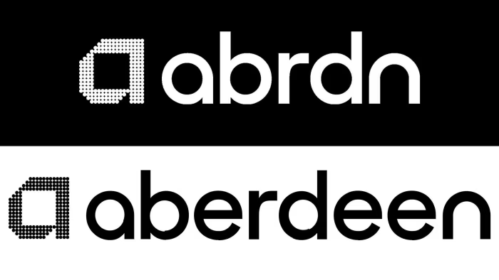
Rebrands can be tricky, change too little, and it feels pointless; change too much, and you risk alienating everyone. Enter Abrdn (pronounced “Aberdeen” but missing vowels for… reasons).
The Rebrand No One Asked For
In 2021, Standard Life Aberdeen, a well-established UK investment company, decided to revamp its image. They wanted a sleek, modern identity fit for the digital age. Their solution? Dropping the vowels to keep it “modern.”
Abrdn was meant to look bold and contemporary, but instead, it became a punchline. People struggled to pronounce it, clients were confused, and the finance world collectively went, why?
The Backlash
Critics shredded the name for being gimmicky and impractical. Employees weren’t thrilled either. Even branding experts pointed out that credibility matters in financial services, and Abrdn felt more like a failed startup than a legacy institution.
The (Inevitable) Course Correction
By 2025, after years of awkward explanations and lingering mockery, the company admitted defeat. New leadership brought back the fully spelled “Aberdeen” in their name, and completed it with the word “Group.” So, they’re officially called “Aberdeen Group” now. They did keep the vowel-less name for their website domain though. This proves that sometimes, keeping it simple (but not too simple) is the way to go.
The Lesson?
- Recognizability matters – If people can’t say or spell your name, they won’t remember it.
- Test before you commit – A little market research could’ve saved Abrdn a world of embarrassment.
- Trendy ≠ timeless – Cool typography won’t fix a name that makes no sense.
Rebrand The Right Way

DOWNLOAD OUR FREE REBRANDING WORKBOOK
Wrapping Up
Rebranding is a powerful way to stay relevant while staying true to your roots. The key is evolution, not revolution, respecting what makes your brand great while ensuring it continues to thrive in a rapidly changing world.
If your brand is due for a refresh, take a strategic, thoughtful approach. Your past is an asset, use it as a foundation for a future-proof identity. But, always remember, your brand isn’t just a logo, it’s the story you tell and the experience you create.
Here’s to building a brand that stands the test of time.

—-
Ready to Give Your Brand a Fresh Look?
At Nicole Steffen Design, we specialize in crafting unique, modern brand identities that stay true to your core while embracing the future.
Whether you’re looking for a full rebrand or just a strategic refresh, we’ll help your brand stay relevant, recognizable, and ready to connect with your audience.
Let’s create something unforgettable together. Contact us today to start your brand’s evolution!