
Striking the right chord with color can mean the difference between a brand’s subdued whimper or a siren call that resonates within your target’s mind. But finding the perfect palette—one that unites the eyes of your consumers—is a task that often demands more than just a discerning eye. This is where the right tools step in, turning the complex task of color selection into a delightful digital playground. Here, we explore the technicolor world of tools designed to help you craft color palettes that pop.
A Roller Tray of Tools
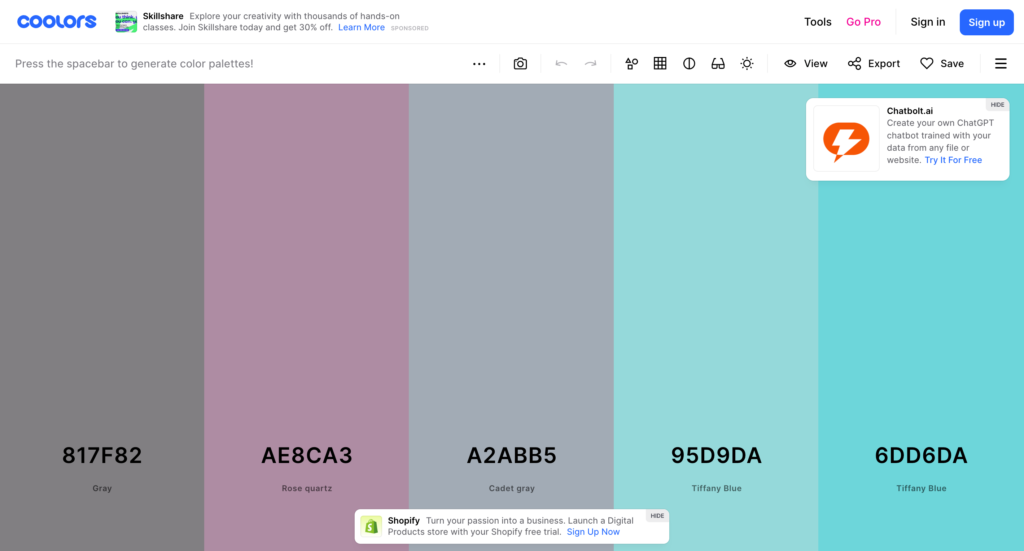
Coolors.co: The Whiz Kid
Coolors.co has become the go-to for many due to its sheer simplicity. With just a press of the spacebar, you’re instantly gifted a brand new five-color palette that’s both enchanting and cohesive. But where Coolors truly shines is its blend modes, which allow you to layer colors just as you would in a photo editing program, letting you fine-tune your selections without limitations.
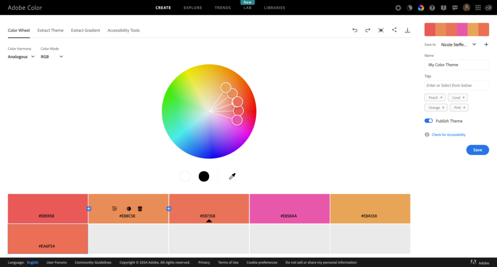
Adobe Color: The Maestro’s Choice
Adobe Color, formerly known as Adobe Kuler, emerges as the seasoned veteran, backed by Adobe’s artistry and long-standing trust. What sets it apart is its deep integration with Adobe’s Creative Suite, potentially making your color palette a seamless extension of your design process. Its community feature is a treasure trove of user-created palettes, ensuring inspiration is never out of reach.
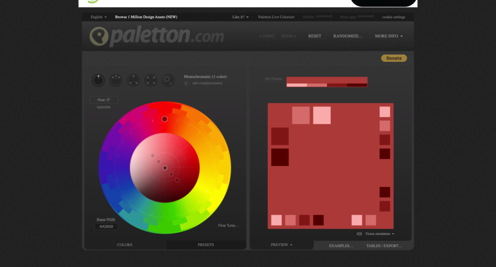
Paletton: The Theorist’s Delight
Paletton is for those who want to roll up their sleeves and truly understand what makes colors tick. Founded on color theory, Paletton’s wheel interface lets you explore complimentary, adjacent, triad, and even custom color relationships, educating users on the art and science of colors while crafting the perfect palette.
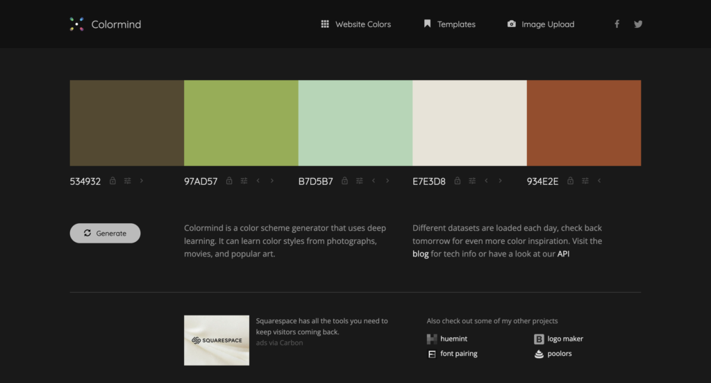
Colormind: The AI Apprentice
Colormind takes a different approach, leveraging artificial intelligence to generate color palettes from scratch. The site produces palettes ready for branding, web design, or any creative work by analyzing uploaded images or the surrounding environment. It’s like having an intuitive assistant that operates purely on calculated aesthetics.
These tools form the foundation, giving marketers the capability to build their visual appeal with precision and creativity. But what’s a palette without a purpose?
The Unseen Thread
At its core, brand consistency is the hidden factor that transforms independent ideas into a collective message. Cohesive color schemes across all platforms—be they digital, print, or experiential—impart a sense of trust. They layer their power over time, until the mere appearance of those hues conjures an instinctive association with a product or service, giving the brand a voice that doesn’t merely speak but resonates.
Navigating the vast ocean of branding, particularly color branding, is both an art and a science. Here are a few personal tips to steer you in the right direction:
- Get Onboard with a Comprehensive Brand Guide: Begin with a well-documented brand guide. This manual should not only list your primary and secondary color palettes but, ideally, explain the reasoning behind them. What emotions do they evoke? When and where should each color be used? A brand guide acts as your North Star, ensuring that every piece of content aligns with your brand’s vision and values.
- Flexibility Within Frameworks: While consistency is crucial, rigidity can stifle a brand. It’s okay to color outside the lines occasionally, especially during special events, holidays, or for limited-time promotions. Such exceptions should be documented within the brand guide itself, providing structured flexibility. This approach ensures that when you do diverge from your usual palette, it’s a deliberate decision that enhances, rather than dilutes, your brand identity.
- Test and Iterate: Market responses can be surprising. What works theoretically doesn’t always translate into success in practice. Don’t be afraid to A/B test variations in your branding to see what truly resonates with your audience. However, ensure that these tests are conducted in controlled environments, and any long-term changes are reflected back in your brand guide.
- The Importance of Context: Remember, the context in which your colors are used can dramatically alter their perception. The same colors that convey luxury and elegance on premium packaging might not hold the same weight on a digital pop-up ad. Acknowledge and plan for these differences in your brand guide.
In the end, your brand’s color palette is not just a set of colors but a set of emotions, expectations, and experiences. By carefully crafting a brand guide that accommodates creative explorations within a structured framework, you empower your brand to remain consistent yet dynamic, keeping your audience engaged and intrigued throughout their journey with you.
Theory of Chromatic Harmony
Before throwing colors onto the canvas with wild abandon, understanding some of the principles behind color theory is crucial. Comprehending how colors interact and reinforce or negate each other is fundamental to creating sensory experiences that not only look good but feel right. It’s the harmony in a scale, the balance in a composition, and the rhythm in the visual narrative.
- The Master Wheel of Colors
Colors don’t operate in a vacuum. The color wheel is your foundational tool, showcasing the spectrum’s complexities. Primary, secondary, and tertiary colors, along with their complements, can be your guide in crafting a palette with purpose.
- The Emotional Resonance of Hues
Each color carries an emotional weight, evoking feelings and moods. Red may mean passion, blue could signify calm, and yellow often heralds joy. By incorporating these psychological aspects, you infuse your brand’s identity with a subtle emotional edge that speaks to your audience’s subconscious. These emotional triggers can shift depending on where your audience is from and what cultural background they have.
- Balance and Contrast
A compelling story isn’t just in the words—it’s in the spaces between them. Likewise, your colors need contrast to pop and balance to coalesce. Play with tints, shades, and tones to create interest without overwhelming. Use contrasts wisely, and they will act as markers, guiding the eye through your narrative with intent.
The Digital Canvas Awaits
In the technicolor universe of brand marketing, the palette you select is more than a choice—it’s a tale waiting to be told. Make it a masterpiece, with hues that hang in the collective memory like stars in the night sky. Harness the power of these tools and etch your narrative into the digital firmament.


0 Comments