– Great Lakes Energy –
Non-Profit Logo Design

Non-Profit Logo Design Project Details
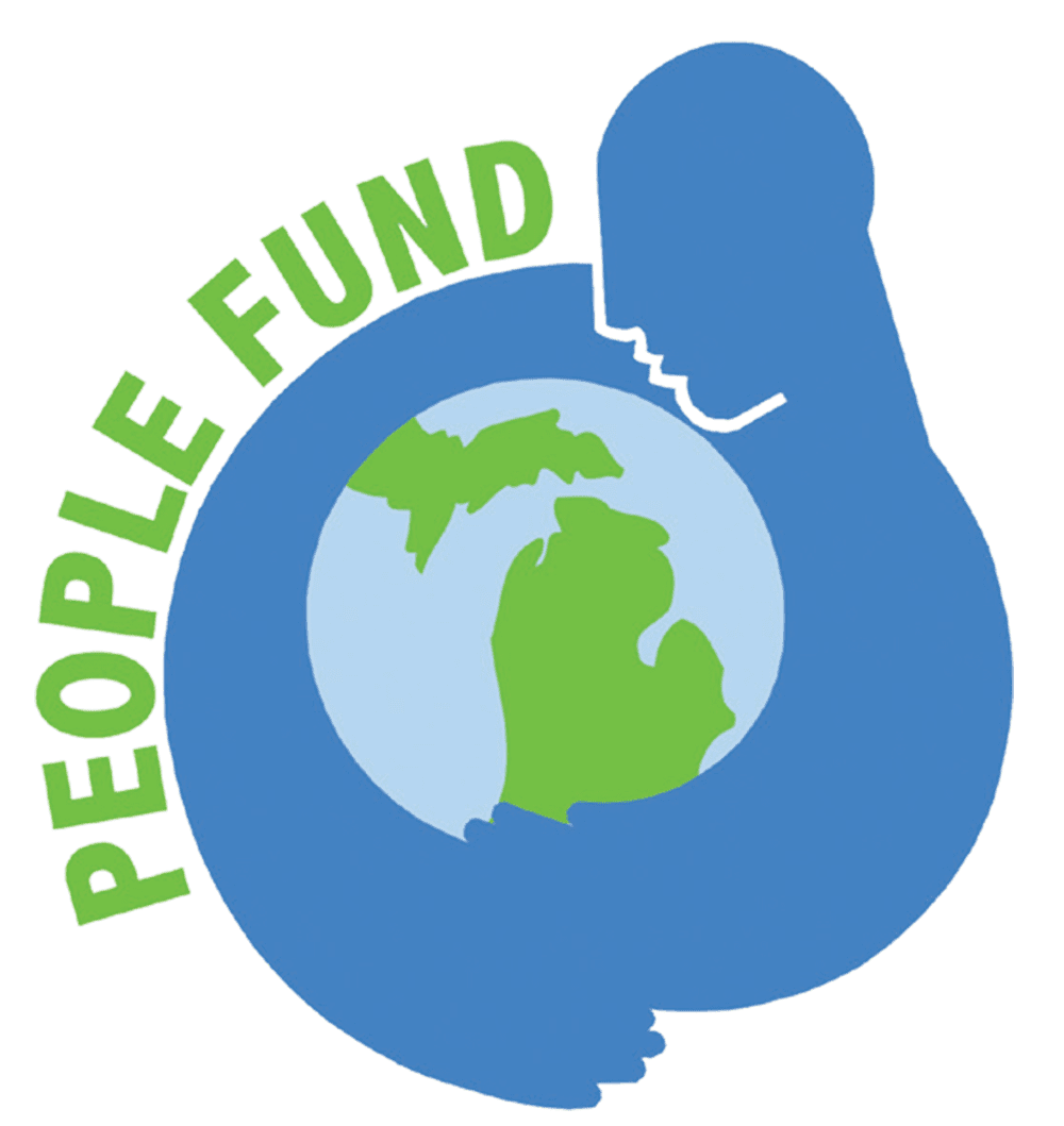
Great Lakes Energy’s People Fund is a significant community service project where participating members’ bills are rounded up to the next dollar amount, and grants are awarded to non-profit organizations for charitable activities throughout their service area. With no overhead costs, the organization returns 100% of the money collected back to the local communities.
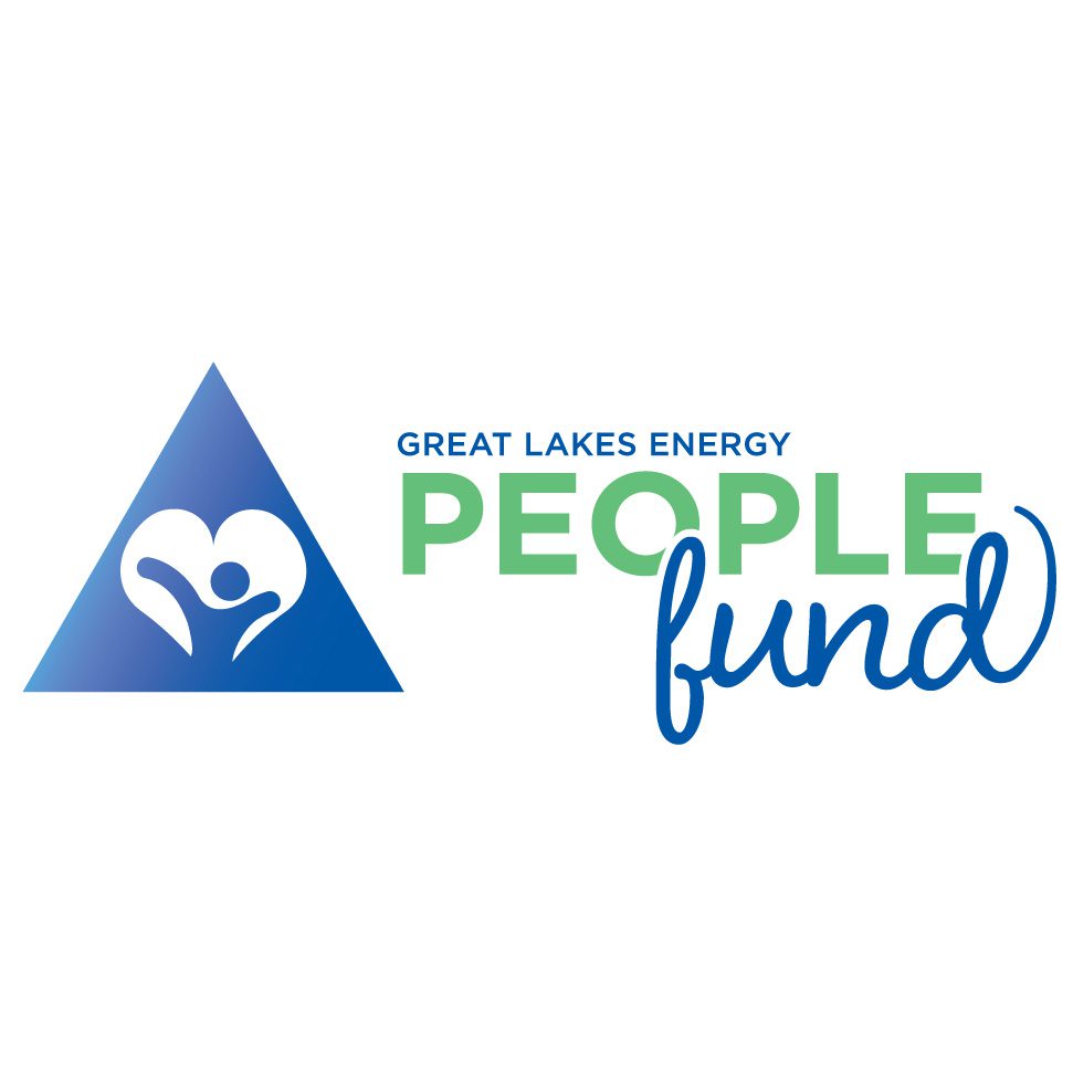
To reflect the People Fund’s core values, an updated logo design was developed by combining elements of the Great Lakes Energy brand, including the triangle, the use of Gotham and Great Lakes Blue. New visual features like a joyful person in a heart and a playful script font we added. Green was incorporated to tie the new logo to the original People Fund logo, creating a natural transition.
The redesigned logo aligns with the Great Lakes Energy brand yet is distinct enough to stand independently and communicates a humanist and friendly approach, reflecting the organization’s community-centered brand identity. The new logo for the Great Lakes Energy People Fund captures the essence of the program. It conveys its commitment to enhancing the quality of life for people in local communities.
Check Out These Great Graphic Design Projects for Great Lakes Energy
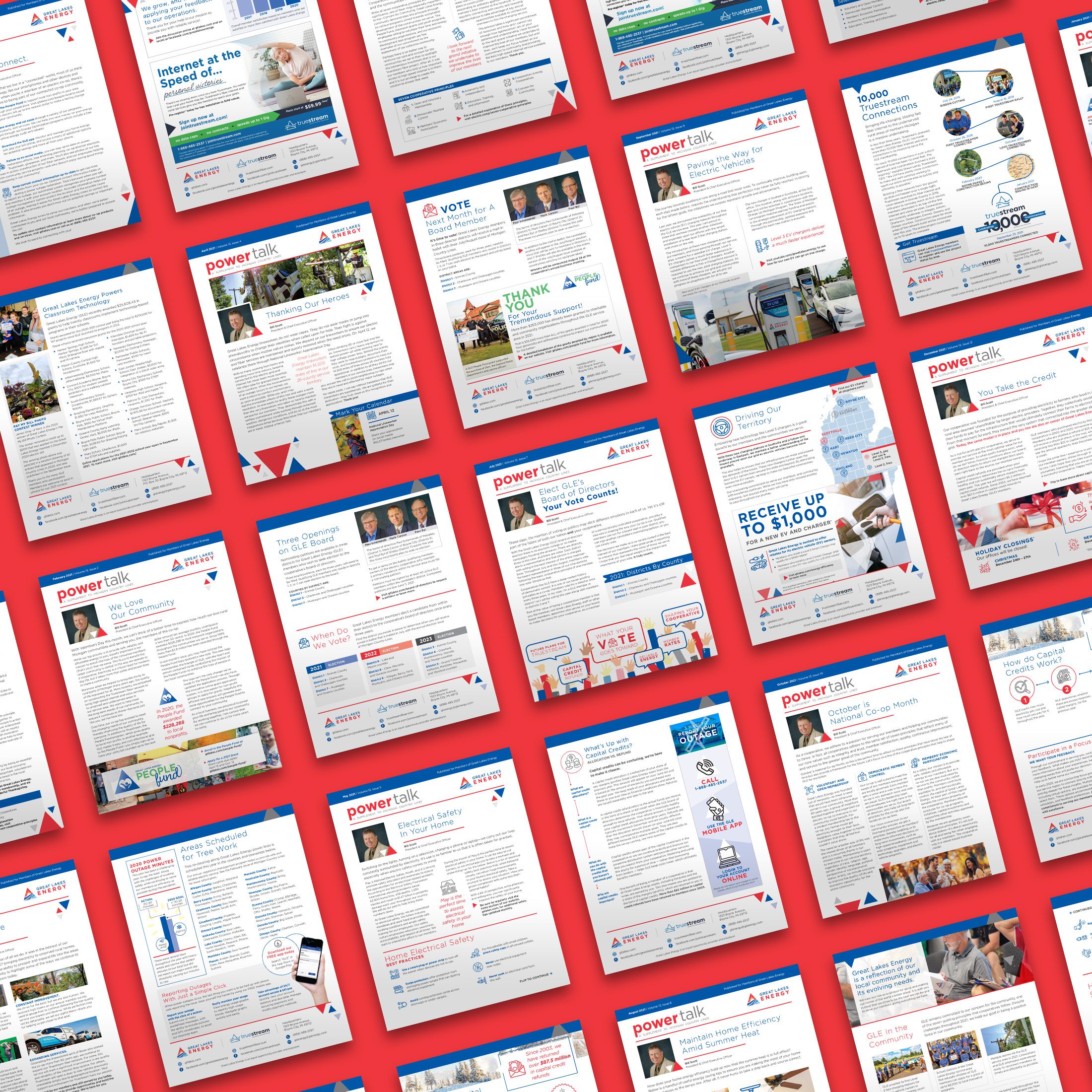
Monthly Powertalk Newsletter
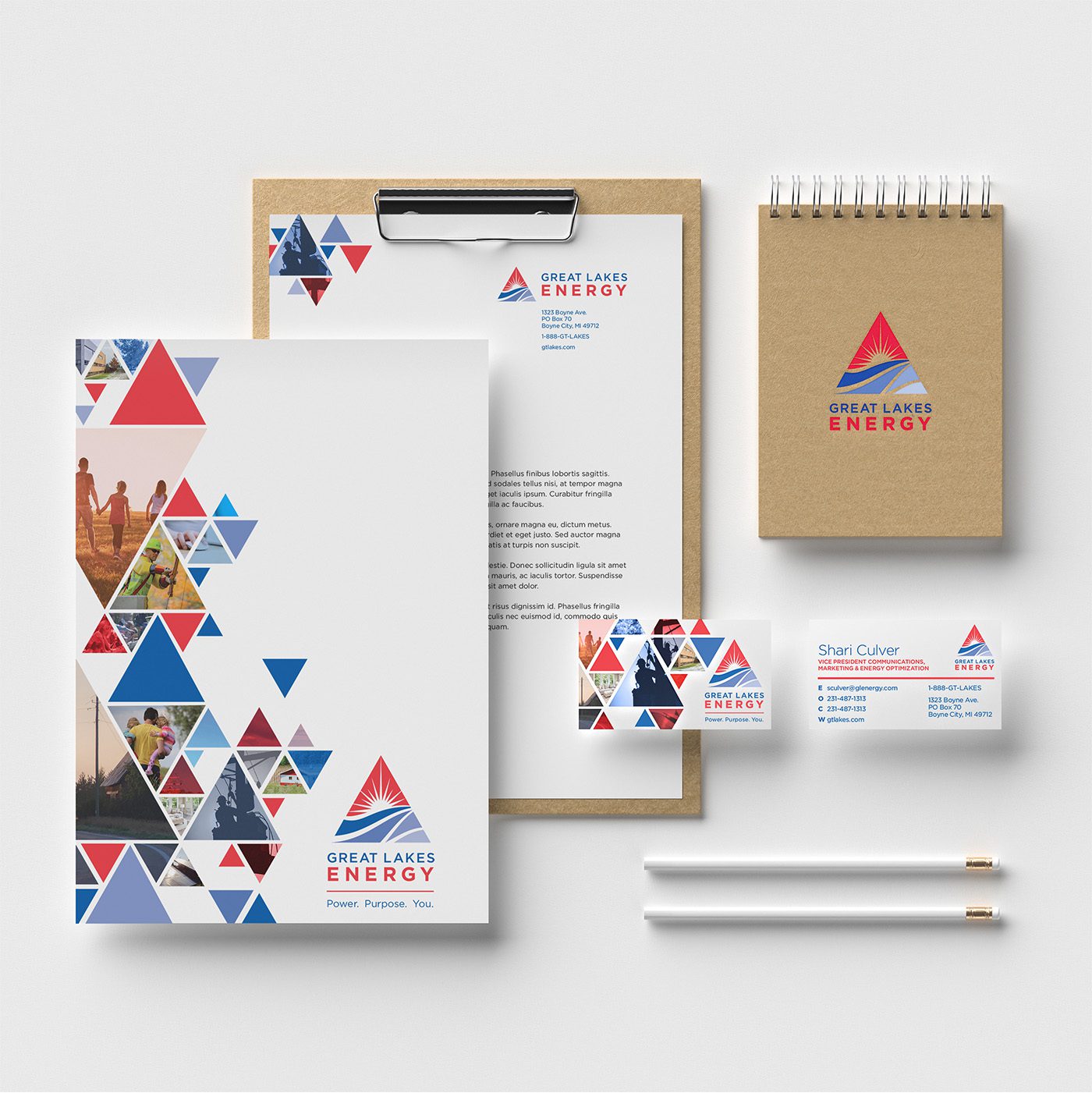
Brand Identity Redesign for Great Lakes Energy