B2B Marketing Rebranding
Healthcare Marketing Agency Brand Design
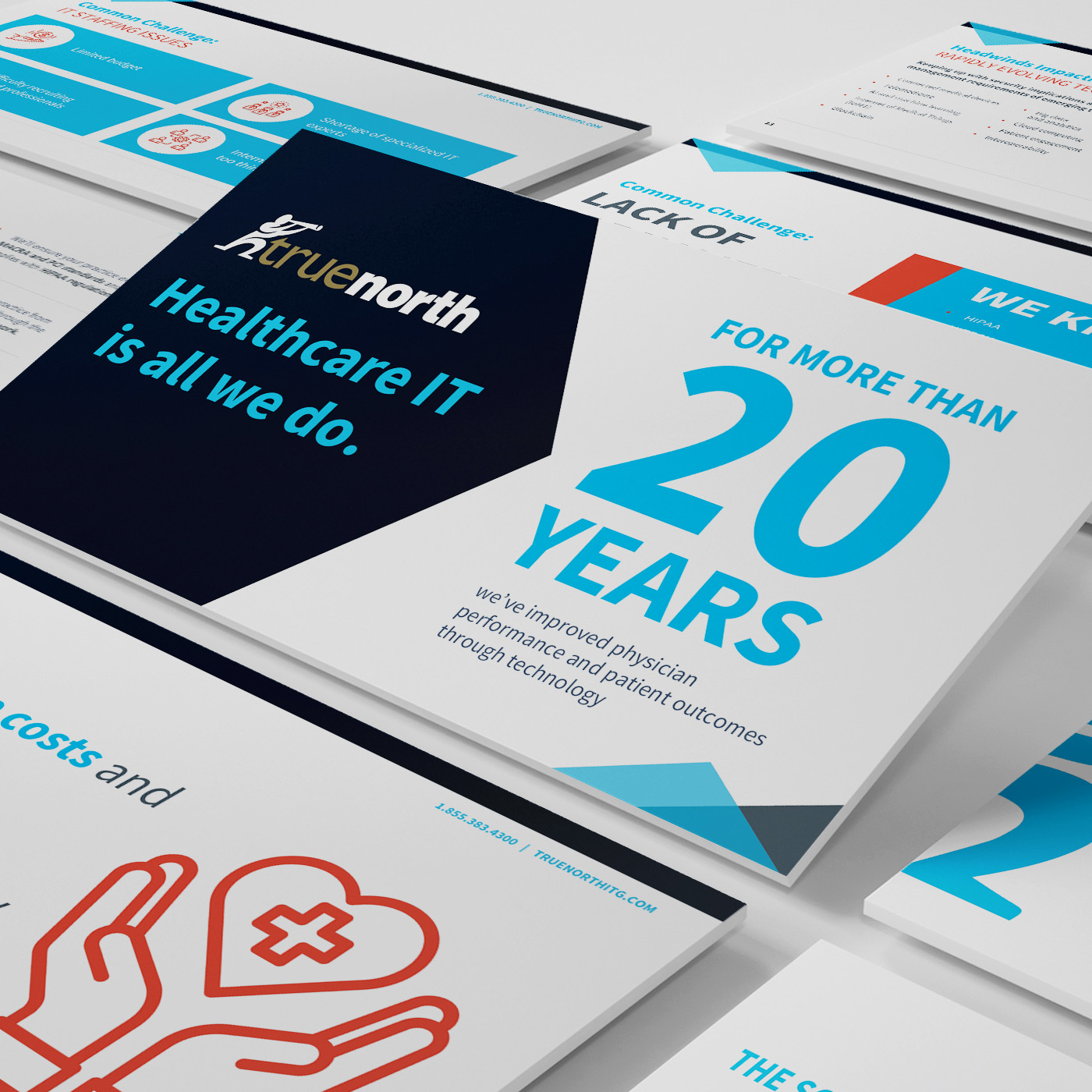
I worked with Slabtown Marketing to redesign their brand. The company has built a reputation for partnering with businesses in the healthcare industry to create and execute brands, websites, growth strategies, marketing content, and communication materials that directly align with their client’s business growth goals. This recent brand redesign is a testament to Slabtown Marketing’s commitment to staying current and relevant in a rapidly evolving market landscape.
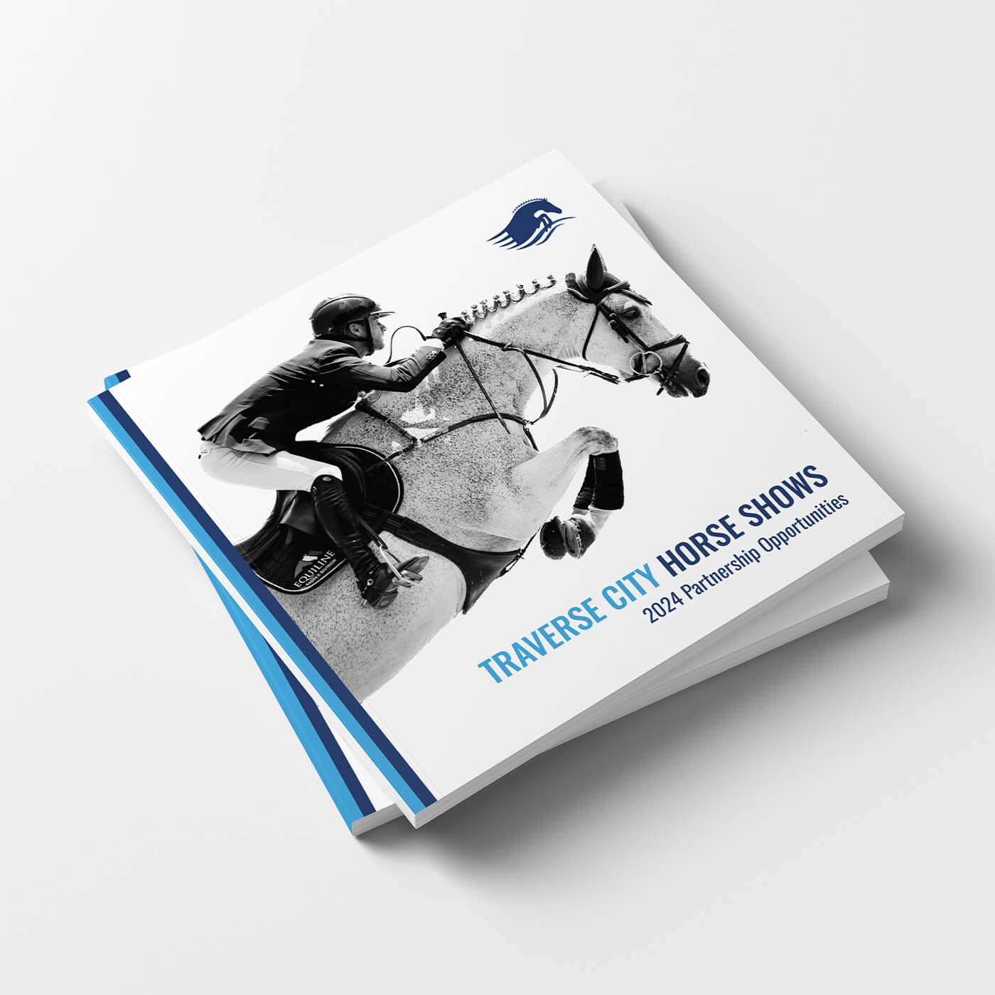
One of the most noticeable changes in this redesign was the transition to a more contemporary look and feel. The new design language is clean, modern, and professional, reflecting the forward-thinking nature of the company. Yet, it maintains a sense of familiarity by preserving some elements from the original brand, such as the distinctive colors.
The brand’s colors, which have become an integral part of Slabtown Marketing’s identity, were retained in the redesign. This decision ensured the brand’s recognizability and continuity while still allowing for a fresh update. These colors continue to convey the brand’s values and vision and provide a visual link to its established reputation in the healthcare marketing industry.
The redesign also involved the selection of new fonts. The typography now employed by Slabtown Marketing is modern and legible, enhancing the overall user experience. This font selection complements the brand’s contemporary aesthetic while ensuring that information is communicated effectively and efficiently.
Perhaps the most significant change in the redesign was the introduction of a new logo. The logo, often considered the face of a brand, was revamped to embody the evolution of Slabtown Marketing. The new logo maintains a connection to the company’s roots but is redesigned to reflect its growth and future direction.
In conclusion, the brand redesign of Slabtown Marketing is a strategic move that merges tradition with innovation. It retains key elements from the original brand, such as the colors, while introducing new elements like a contemporary design language, new fonts, and a fresh logo. This redesign not only reflects the company’s growth but also its readiness to adapt and stay relevant in a dynamic industry.