In a room, four logos sit in a circle during a group session. The London Olympics 2012 logo stands at the front, with a clipboard in hand.
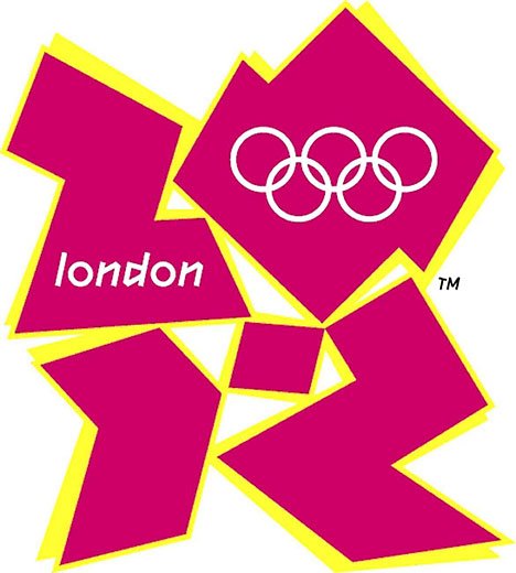 London Olympics 2012: Good evening, and welcome to this little gathering. It’s been years, but our design scars remain. Tonight, we reflect on our missteps. (Gestures) Kudawara Pharmacy, would you like to begin?
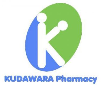 Kudawara Pharmacy: (Bows respectfully) Thank you. It was an honor to represent a trusted healthcare provider. Unfortunately, my designers wanted to be overly clever. The merging of the “K” and “P” was meant to be sleek, but it unintentionally resembled something else. Instead of health and wellness, I became a cautionary tale.
London Olympics 2012: (Nodding) A tragic misunderstanding. OGC, how about you?
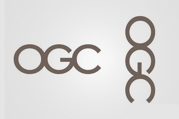 OGC 2000: (Adjusts glasses stiffly) As a government agency, we aimed for authority and simplicity. Strong, clear letters: OGC. But somebody thought it funny to rotate me and then, well, I looked quite unprofessional.
London Olympics 2012: (Sympathetic) A bureaucratic blunder, indeed. Gap, would you like to share?
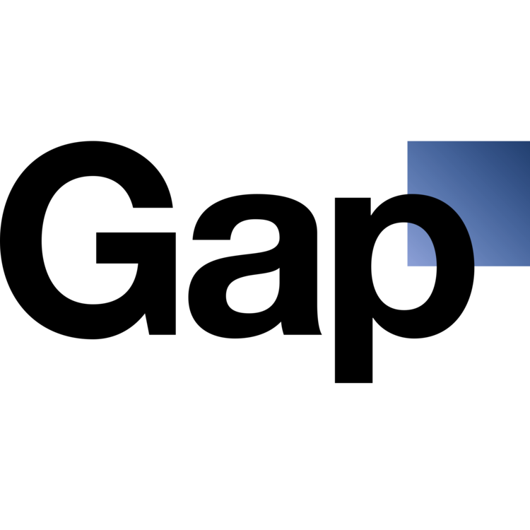
Gap 2010: Of course. As a global retail icon, my goal was modern sophistication. We introduced a sleek sans-serif font with a blue gradient box. I looked bold and refined. (Pauses, then scowls) But consumers found me generic, demanding the classic serif logo back. I was pulled after just six days. Six! A fashion trend would’ve lasted longer.
London Olympics 2012: (Sighs) Well said, everyone. Remember, we weren’t failures, just misinterpreted. (Checking clipboard) Let’s take a short break. Up next: Pepsi’s “belly-out man” era will share his story.
—
A logo is your brand’s visual ambassador. It’s the face people recognize that says, “Hey, you can trust us!”
Yet, so many brands shoot themselves in the foot with logos that are either outdated or just plain forgettable.
How do you avoid this fate?
Whether you’re building a logo from scratch or giving your current one a facelift, dodging these common design traps is key.
The Anatomy of a Great Logo
Before we get into the don’ts, let’s talk about the do’s.
Think of the most iconic logos. What do they have in common? They’re simple yet distinct.
I know you’re already rolling your eyes at this cliché example, but hear me out: Apple.
Their logo? It’s just an apple. No text. No fancy effects. And yet, it’s one of the most recognizable symbols in the world.
Why? Simplicity sticks.
The human brain is wired to remember clean, recognizable shapes. A Harvard Business Review study analyzing 597 logos found that simple logos are more memorable than complex or trendy ones.
When people see a crisp, clear design, it imprints itself on their memory. On the flip side, complicated logos overwhelm the brain, making them harder to recall.
The Power of Versatility
A great logo not only looks good in one place. Ideally, it should work everywhere. From a billboard to a tiny social media profile picture, it never loses its impact. If you shrink, blow it up, or put it on grayscale and the design falls apart, it’s failing the versatility test.
Logos with Personality Leave a Mark
Another critical magic ingredient to a great logo design is personality.
The best logos say something about the brand, even without words. It’s these often unnoticed design details that inject depth and meaning into them.
Take Amazon. Their logo has a subtle smile hidden in the arrow that stretches from A to Z. It’s a clever nod to their vast selection and their goal to leave customers happy.
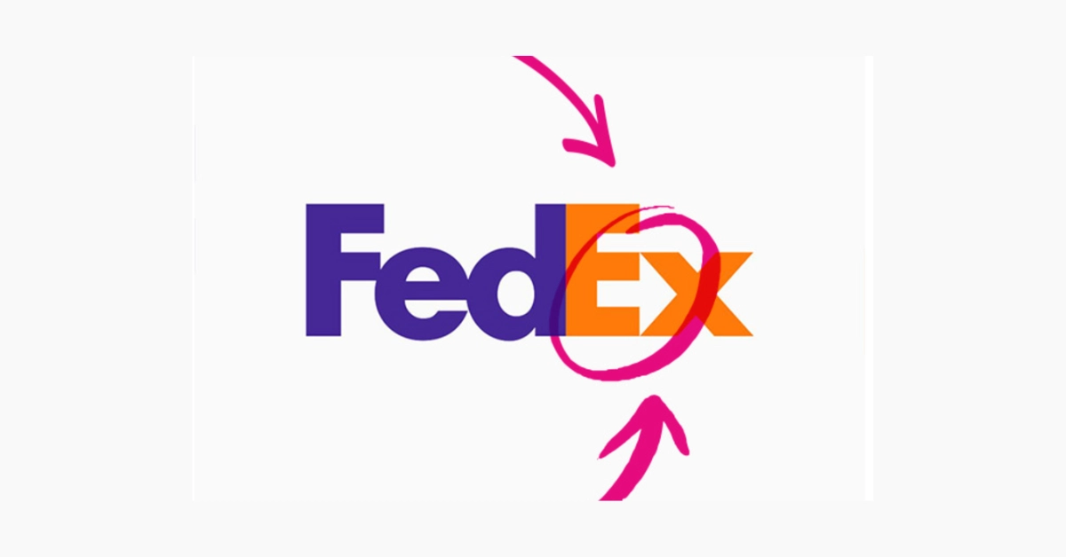
There’s also FedEx, with its hidden arrow in the negative space between the “E” and “x.” It’s a brilliant, blink-and-you’ll-miss-it symbol of speed and precision, perfect for a shipping company.
Apple’s bite mark even has a story. On the surface, it’s just an apple with a chunk missing. But it subtly hints at pushing boundaries and defying perfection, a core part of Apple’s brand ethos.
These small design choices might seem trivial, but they give logos depth. They make people pause for half a second, think, and then smile when they catch the hidden meaning. It’s this emotional connection that makes a logo stick.
Forgettable or Iconic? Making People Remember You
Logo No-No #1 — Following Fleeting Trends
Raise your hand if you’ve ever seen a logo that looks suspiciously like every other startup from the last five years.

Remember the gradient logo craze? For a while, it felt like every tech company ditched their flat logos in favor of multicolored gradient chaos. It was trendy, sure, but like shoulder pads and frosted tips, it didn’t age well. Now, many of those once-sleek logos look painfully dated.
This is the problem with trend chasing. It puts a countdown clock on your logo design. It might look edgy and current today, but in a few years, it could feel as stale as a Myspace profile.
Now, don’t get me wrong; staying visually relevant is important. I’m not saying your logo needs to be carved in stone and left unchanged for the next century. But blindly following design fads is a slippery slope.
So, how do you avoid falling for trendy logo designs that could only look good for a few years? You focus on timelessness. Design your logo with clean lines, beautiful clear shapes, and balanced proportions.
Want proof this works? Look at Mitsubishi’s red three-diamond logo, it’s been left almost unchanged for over 150 years. Or McDonald’s golden arches, which are still going strong decades later. Both of these logos transcend trends because they’re built on timeless design instead of fleeting aesthetics.
When in doubt, ask yourself one question: “Will this logo still look good in 10 years?” If the answer is anything other than a confident “yes,” it’s time to go back to the drawing board.
Logo No-No #2 — Making Designs Too Complicated
So you’re cruising down the highway when a massive billboard comes into view. You squint at the logo, trying to make sense of it. There are swooshes, gradients, and a confusing tangle of lines. By the time your brain finishes decoding it, you’ve already sped past, and honestly? You’ve lost interest.
That’s the problem with overcomplicated logos. They try to do too much. Everything is crammed into one design like a brand identity buffet.
The most effective logos? They’re minimalists. They cut the clutter and let the core idea shine.

Look at Target. Their logo is just a red and white bullseye. That’s it. No frills, no gimmicks. And yet, it’s instantly recognizable from a mile away. That’s the power of restraint, it makes your logo easy to spot and even easier to remember.
Logo No-No #3 — The Raster Disaster
You’ve just received the final files for your shiny new logo. Woohoo! You excitedly open the folder, expecting the works – crisp, high-quality images that will look flawless on anything.
Instead, you find JPGs and PNGs. (Yikes!) You’ve officially been hit by the raster disaster.
Here’s the problem. Raster files (JPG, PNG) are made of pixels. They look fine on a screen, but the moment you blow them up for a poster, banner, or storefront sign, they will turn into a blurry mess. It’s like trying to zoom in on an old cell phone photo, you just get bigger pixels, not more detail.
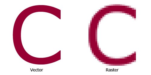
What you need instead are vector files. Vectors (like SVG, EPS, or AI) are resolution-independent, which means they can be resized infinitely without losing quality. Whether your logo appears on a tiny app icon or a massive billboard, it’ll stay sharp and flawless.
If your designer only sends you raster files, ask for the vector versions, too. Better yet, request a full logo package with both raster and vector formats. That way, you’ll be ready for any application, from digital to print.
Logo No-No #4 — Picking the Wrong Colors or Fonts
Your logo’s colors and fonts are the first thing people see before they read a single word about you. Get them wrong, and your logo could be sending all the wrong signals.
Using too many hues can make your logo feel chaotic, while low-contrast color combos make it hard to read. And trendy palettes? They might look fresh now, but they can age faster than avocado toast.

Fonts are just as sneaky. Sure, we all know that Comic Sans and Papyrus are no-go zones. But even sleek, stylish fonts can backfire if they’re too trendy. That gorgeous script might be hot today, but it can feel dated in a year.
So, what’s the move?
Stick to two or three core colors with strong contrast for readability and choose timeless, professional fonts that won’t make your logo feel like a relic in five years.
Logo No-No #5 — Scalability Problems
Let’s talk about a logo’s work ethic. A great logo is like your most reliable team member. It shows up and delivers no matter where you need it. Whether it’s on a website, a T-shirt, or a billboard, it should look sharp and clear.
But if your logo only looks good in one specific context (say, your website header) and falls apart everywhere else, you’ve got an issue.
Even if your logo is made with vector files, it can still have scalability problems if the design itself is too intricate. Tiny details, thin lines, and complex color gradients might look stunning on screen, but when shrunk or scaled, they can blur into oblivion.
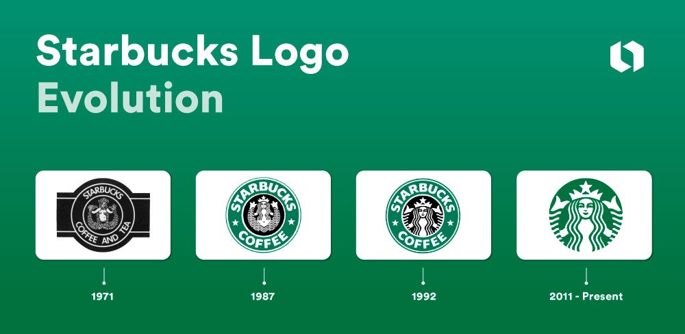
Take Starbucks, for example. Their original 1971 logo was a detailed woodcut illustration of a siren, complete with flowing hair and intricate scales. It worked fine on a coffee bag but was a disaster for signage. The details were too fine, making it illegible from a distance.
What did they do? They simplified it.
Over time, they stripped away the fussy details, keeping only the essence of the siren. The result? Their current logo is sleek, recognizable, and looks great everywhere.
To test for scalability, shrink your logo down to the size of a favicon (16×16 pixels) and blow it up to billboard dimensions. If it loses clarity or becomes unreadable, it needs simplification.
Some brands take this into account by creating a response logo to ensure their brand logo is still recognizable in any setting. Remember, your logo needs to hold up reproduction in every format: black-and-white, inverted, on a transparent background, and in both digital and print media.
Logo No-No #6 — Making it Too Literal and Generic
If your company is called Red Mountain Realty and your logo is (surprise!) a red mountain, then congratulations, you’ve officially joined the literal logo club.
Sure, it’s tempting to go the obvious route, but literal logos are often bland and cliché. Worse, they look like every other logo in your industry.
You can spot examples of this in real estate companies. How many logos shaped like houses have you seen? Come on, tell me the truth.
Literal logos can say what you do but not who you are. They lack personality and distinctiveness, two things that make logos memorable.
Having such a generic-looking logo design can be damaging. Those abstract shapes, weird swooshes, and stock-looking icons can make things look so interchangeable. If, in the end, the logo you come up with is something that could be swapped for other companies, then it’s far from a success.
Best Practices — How to Ensure Your Logo Leaves a Lasting Impression
Now that we’ve covered the pitfalls, let’s talk about how to create a logo that works hard for your brand.
Keep It Simple and Scalable
The best logos are like visual haikus, minimal but powerful. They capture big brand ideas in clean, unmistakable symbols.
Your logo needs to work the same way. If someone has to squint, tilt their head, or decipher strange abstract shapes to figure out what it is, you’ve already lost them. The whole point of a logo is instant brand recall.
To make sure yours holds up, test it everywhere: on your website, social media profiles, brochures, and even unexpected places like pens or hats. If it looks good in every context, you’ve nailed the scalability. If it loses its impact, create a response logo or simplify.
Go Timeless, Never Trendy
Trendy logos might look slick today, but they’ll age like milk. Remember the early 2000s obsession with glossy, 3D logos and futuristic gradients? Yeah, those didn’t age well. You can also check out this article for how logo designs have evolved over the years.
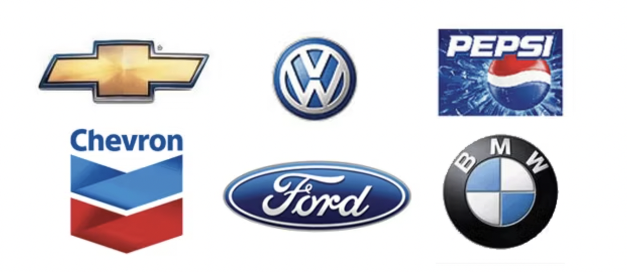
The logos that stand the test of time are the ones that steer clear of fads. They rely on clean, bold shapes and classic color palettes rather than chasing gimmicky design trends.
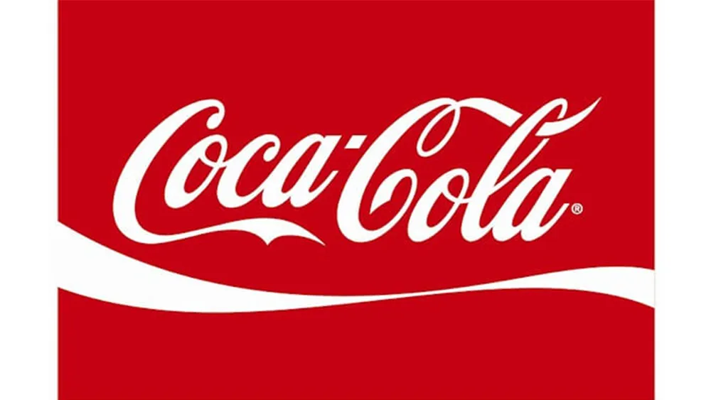
Look at Coca-Cola, for instance. Its script logo, which dates back to the late 1800s, is still going strong. Sure, it’s been refined over the years, but the core identity has remained timeless.
When designing your logo, aim for clarity and longevity. Choose strong, clear lines and color palettes that will still make sense a decade from now.
Aim for Versatility
More than just your website, your logo is going to be everywhere in your brand. It’ll be slapped on business cards, social media, packaging, promo merch, and maybe even the side of a truck. If it can’t hold its own across all those platforms, it’s failing the versatility test.
To future-proof your logo, you need it in vector format (SVG, EPS, or AI). Vectors are your logo’s best friend, they can be scaled up or down infinitely without losing an ounce of quality.
Also, consider what it will look like in full color or black and white, transparent or with certain colored backgrounds, or even how it will look when placed in specific contexts. If the design holds up, then you probably have a winner on your hands.
Don’t Skimp on Design Quality
I get it, cutting corners can be tempting, especially when there are a million DIY logo generators and cheap Fiverr designers offering “pro-level” logos for next to nothing. However, your logo is not the place to cheap out.
A logo is the face of your brand. It’s the visual cue that people associate with your business. A flimsy, generic design will make your brand look flimsy and generic, too.
Hiring a professional brand designer or agency might cost more upfront, but it’s worth it. A skilled designer knows how to create a logo that’s visually appealing and strategically sound. They’ll consider scalability, color psychology, and long-term usability, things you won’t get from a $20 logo generator or a $10 Fiverr logo designer.
A good logo is an investment in your brand’s future. So, spend the money. You’ll thank yourself later when you have a logo that not only looks great but will hold its own for years.
Make Your Logo Work for You
Your logo is part of your brand identity. It’s the thing people recognize and remember long after they’ve forgotten your tagline.
A weak logo doesn’t just look bad, it makes your business look bad. You could be selling the most brilliant product or delivering game-changing services, but if they see your logo as cheap or forgettable, people will assume the same about your company. It’s not fair, but it’s human nature.
So, before you finalize your logo, ask yourself:
- Does it work in every size and format?
- Will it still look good in 10 years?
- Is it unique, memorable, and unmistakably yours?
If you can answer “yes” to all three, you’ve got a keeper.
Otherwise? Go back to the drawing board.
Remember, your logo is part of your reputation. It is a first impression and your visual signature. Make it one that people actually want to remember.
—
Need help crafting or refreshing your brand? At Nicole Steffen Design, our goal is to craft brand identities that stand the test of time. Schedule a call with us today! And let’s create a brand identity that showcases who you truly are!